作者:ruanbaoshuijingkou | 来源:互联网 | 2023-08-04 12:17
视频:
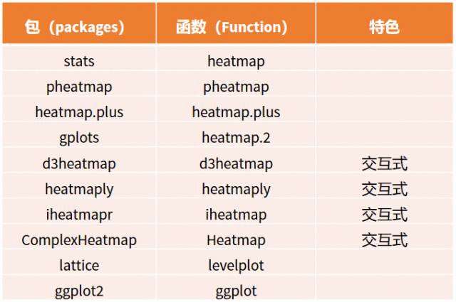
# 热力图(相关矩阵)
import seaborn as sns
import matplotlib.pyplot as plt
#准备数据,协方差矩阵
dfData = df.corr()
# 设置画布大小,分辨率,和底色
plt.figure(figsize=(30,8),dpi=60,facecolor='w')
# 让plt可以正常显示中文和英文
plt.rcParams['font.sans-serif']=['Times New Roman']
plt.rcParams['axes.unicode_minus'] = False
fontcn = {'family': 'SimHei'}
fonten = {'family':'Times New Roman'}
#画出热力图
sns.heatmap(dfData, annot=True, vmax=1, square=True, cmap="Reds")
# sns.heatmap中annot=True,意思是显式热力图上的数值大小。
# sns.heatmap中square=True,意思是将图变成一个正方形,默认是一个矩形
# sns.heatmap中cmap="Blues"是一种模式,就是图颜色配置方案啦,我很喜欢这一款的。
# sns.heatmap中vmax是显示最大值
#保存和显示图像
plt.savefig('heatmap.png',bbox_inches='tight',transparent = True) #bbox_inches='tight'让图像完整显示,transparent = True让图片背景为透明
plt.show()


 京公网安备 11010802041100号