可以和理论相结合学习:https://blog.csdn.net/qq_36002089/article/details/108378796
语音信号是一个非平稳的时变信号,但语音信号是由声门的激励脉冲通过声道形成的,经过声道(人的三腔,咽口鼻)的调制,最后由口唇辐射而出。认为“短时间”(帧长/窗长:10~30ms)内语音信号是平稳时不变的。由此构成了语音信号的“短时分析技术”。帧移一般为帧长一半或1/4。
import matplotlib
import pyworld
import librosa
import librosa.display
from IPython.display import Audio
import numpy as np
from matplotlib import pyplot as plt
import mathx, fs = librosa.load("ba.wav", sr=16000) #librosa load输出的waveform 是 float32
x = x.astype(np.double) # 格式转换fftlen = pyworld.get_cheaptrick_fft_size(fs)#自动计算适合的fftlenplt.figure()
librosa.display.waveplot(x, sr=fs)
plt.show()
Audio(x, rate=fs)
这是ba的四种音调。巴,拔,把,爸。

傅里叶变换的意义就是任意信号都可以分解为若干不同频率的正弦波的叠加。
语音信号中,这些正弦波中,频率最低的称为信号的基波,其余称为信号的谐波。基波只有一个,可以称为一次谐波,谐波可以有很多个,每次谐波的频率是基波频率的整数倍。谐波的大小可能互不相同。以谐波的频率为横坐标,幅值(大小)为纵坐标,绘制的系列条形图,称为频谱。频谱能够准确反映信号的内部构造。
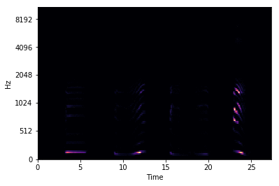
语谱图综合了时域和频域的特点,明显的显示出来了语音频率随时间的变化情况,语谱图的横轴为时间,纵轴为频率,颜色深表示能量大小,也就是|x|^2.
语谱图上不同的黑白程度形成不同的纹路,称为声纹,不用讲话者的声纹是不一样的,可以用做声纹识别。
其实得到了分帧信号,频域变换取幅值,就可以得到语谱图,如果仅仅是观察,matplotlib.pyplot有specgram指令:
plt.figure()
plt.specgram(x,NFFT=fftlen, Fs=fs,noverlap=fftlen*1/4, window=np.hanning(fftlen))
plt.ylabel('Frequency')
plt.xlabel('Time(s)')
plt.title('specgram')
plt.show()
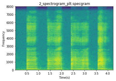
这个是plt自带的谱图函数。
此时是STFT后做了log后的结果,默认功率谱密度PSD,y_axis='linear’或不填,都认为是linear,不做scaling。若为PSD,则默认y_axis=‘的dB’,此时计算10*log10. 若选择‘magnitude’, 则计算(20 * log10).具体的可以看下面这个函数的说明:
def specgram(self, x, NFFT=None, Fs=None, Fc=None, detrend=None,window=None, noverlap=None,cmap=None, xextent=None, pad_to=None, sides=None,scale_by_freq=None, mode=None, scale=None,vmin=None, vmax=None, **kwargs):"""Plot a spectrogram.Call signature::specgram(x, NFFT=256, Fs=2, Fc=0, detrend=mlab.detrend_none,window=mlab.window_hanning, noverlap=128,cmap=None, xextent=None, pad_to=None, sides='default',scale_by_freq=None, mode='default', scale='default',**kwargs)Compute and plot a spectrogram of data in *x*. Data are split into*NFFT* length segments and the spectrum of each section iscomputed. The windowing function *window* is applied to eachsegment, and the amount of overlap of each segment isspecified with *noverlap*. The spectrogram is plotted as a colormap(using imshow).将数据分成*NFFT*长度段,计算每个段的频谱。窗口函数*window*应用于每个段,每个段的重叠量用* overlap *指定。谱图被绘制成彩色地图(使用imshow)。Parameters参数----------x : 1-D array or sequenceArray or sequence containing the data.%(Spectral)s%(PSD)smode : [ 'default' | 'psd' | 'magnitude' | 'angle' | 'phase' ]What sort of spectrum to use. Default is 'psd', which takesthe power spectral density. 'complex' returns the complex-valuedfrequency spectrum. 'magnitude' returns the magnitude spectrum.'angle' returns the phase spectrum without unwrapping. 'phase'returns the phase spectrum with unwrapping.默认模式就是psd,功率谱密度noverlap : integerThe number of points of overlap between blocks. Thedefault value is 128.默认值128scale : [ 'default' | 'linear' | 'dB' ]The scaling of the values in the *spec*. 'linear' is no scaling.'dB' returns the values in dB scale. When *mode* is 'psd',this is dB power (10 * log10). Otherwise this is dB amplitude(20 * log10). 'default' is 'dB' if *mode* is 'psd' or'magnitude' and 'linear' otherwise. This must be 'linear'if *mode* is 'angle' or 'phase'.Fc : integerThe center frequency of *x* (defaults to 0), which offsetsthe x extents of the plot to reflect the frequency range usedwhen a signal is acquired and then filtered and downsampled tobaseband.cmap :A :class:`matplotlib.colors.Colormap` instance; if *None*, usedefault determined by rcxextent : [None | (xmin, xmax)]The image extent along the x-axis. The default sets *xmin* to theleft border of the first bin (*spectrum* column) and *xmax* to theright border of the last bin. Note that for *noverlap>0* the widthof the bins is smaller than those of the segments.**kwargs :Additional kwargs are passed on to imshow which makes thespecgram imageNotes-----*detrend* and *scale_by_freq* only apply when *mode* is set to'psd'Returns-------spectrum : 2-D arrayColumns are the periodograms of successive segments.freqs : 1-D arrayThe frequencies corresponding to the rows in *spectrum*.t : 1-D arrayThe times corresponding to midpoints of segments (i.e., the columnsin *spectrum*).im : instance of class :class:`~matplotlib.image.AxesImage`The image created by imshow containing the spectrogramSee Also--------:func:`psd`:func:`psd` differs in the default overlap; in returning the meanof the segment periodograms; in not returning times; and ingenerating a line plot instead of colormap.:func:`magnitude_spectrum`A single spectrum, similar to having a single segment when *mode*is 'magnitude'. Plots a line instead of a colormap.:func:`angle_spectrum`A single spectrum, similar to having a single segment when *mode*is 'angle'. Plots a line instead of a colormap.:func:`phase_spectrum`A single spectrum, similar to having a single segment when *mode*is 'phase'. Plots a line instead of a colormap."""
由此乐见,默认psd模式,即频谱为功率谱密度,那就再顺便复习下这个概念:
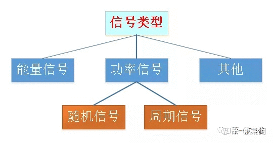
在了解PSD之前,首先回顾一下信号的分类。信号分为能量信号和功率信号。
能量信号全名:能量有限信号。顾名思义,它是指在负无穷到正无穷时间上总能量不为零且有限的信号。典型例子:脉冲信号。
功率信号全名:功率有限信号。它是指在在负无穷到正无穷时间上功率不为零且有限的信号。典型例子:正弦波信号,噪声信号。
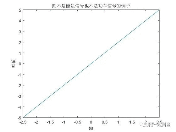
一个信号不可能既是能量信号又是功率信号。能量信号在无穷大时间上功率为0,不满足功率信号功率不为0的定义;而功率信号在无穷大时间上能量为无穷大,不满足能量有限的定义。一个信号可以既不是能量信号也不是功率信号,如下面这个信号,其功率无限能量也无限。
能量信号和功率信号的范围不包括所有的信号类型,这是因为工程上一般就是这两种,足以满足描述的需要了。
功率信号还可以细分为周期信号(如正弦波信号)和随机信号(如噪声信号)。
随机信号的定义:幅度未可预知但又服从一定统计特性的信号,又称不确定信号。
对能量信号和周期信号,其傅里叶变换收敛,因此可以用频谱(Spectrum)来描述;对于随机信号(实际的信号基本上是随机信号),傅里叶变换不收敛,因此不能用频谱来描述,而应当使用功率谱密度(PSD)。工程上的信号通常都是随机信号,即使原始信号是周期信号,由于数据采集过程中存在噪声,实际获得的信号仍然会是随机信号。“频谱”而不是“功率谱密度”这两个概念很多人会混淆起来用,虽然不准确,但是那个意思。
在实际应用中,一个信号我们不可能获得无穷长时间段内的点,对于数字信号,只能通过采样的方式获得N个离散的点。上文提到,实际信号基本上是随机信号,由于不可能对所有点进行考察,我们也就不可能获得其精确的功率谱密度,而只能利用谱估计的方法来“估计”功率谱密度。
谱估计有两种:经典谱估计和现代谱估计。经典谱估计是将采集数据外的未知数据假设为零;现代谱估计是通过观测数据估计参数模型再按照求参数模型输出功率的方法估计信号功率谱,主要是针对经典谱估计的分辨率低和方差性能不好等问题提出的,应用最广的是AR参数模型。经典功率谱估计的方法有两种:周期图法(直接法)和自相关法(间接法)。周期图法是将随机信号的N个采样点视作一个能量有限信号,傅里叶变换后,取幅值平方除以N,以此作为对真实功率谱的估计。自相关法的理论基础是维纳-辛钦定理,即先对信号做自相关,然后傅里叶变换,从而得到功率谱密度。
频谱和功率谱密度的区别:
再用下librosa库:
D = librosa.amplitude_to_db(librosa.stft(y), ref=np.max)#20log|x|
plt.figure()
librosa.display.specshow(D, sr=fs, hop_length=fftlen*1/4,y_axis='linear')
plt.colorbar(format='%+2.0f dB')
plt.title('Linear-frequency power spectrogram')
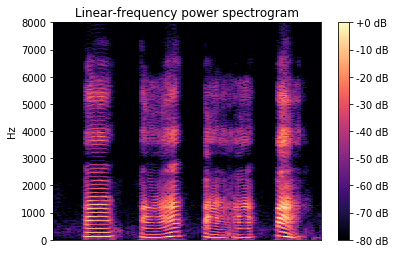
可以看出,效果是一样的。
发现时频图其实和语谱图可视化结果差不多,可能就是区别在幅值平方或者倍数上,但在图上影响不大。
举例:
1.用librosa库
S = librosa.stft(x,n_fft=fftlen)    # 幅值
plt.figure()
librosa.display.specshow(np.log(np.abs(S)), sr=fs,hop_length=fftlen/4)
plt.colorbar()
plt.title('STFT')
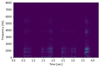
若不进行log:
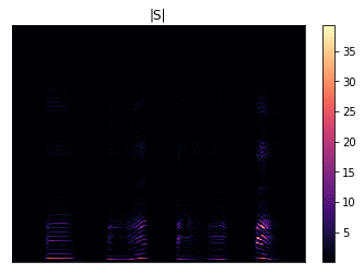
大概可以看到一些纹理,但不是很清晰。下面进行log后:
下面是librosa库的这个spectrum具体用法:
def specshow(data, x_coords=None, y_coords=None,x_axis=None, y_axis=None,sr=22050, hop_length=512,fmin=None, fmax=None,bins_per_octave=12,**kwargs):'''Display a spectrogram/chromagram/cqt/etc.Parameters----------data : np.ndarray [shape=(d, n)]Matrix to display (e.g., spectrogram)sr : number > 0 [scalar]Sample rate used to determine time scale in x-axis.hop_length : int > 0 [scalar]Hop length, also used to determine time scale in x-axisx_axis : None or stry_axis : None or strRange for the x- and y-axes.Valid types are:- None, 'none', or 'off' : no axis decoration is displayed.Frequency types:- 'linear', 'fft', 'hz' : frequency range is determined bythe FFT window and sampling rate.- 'log' : the spectrum is displayed on a log scale.- 'mel' : frequencies are determined by the mel scale.- 'cqt_hz' : frequencies are determined by the CQT scale.- 'cqt_note' : pitches are determined by the CQT scale.All frequency types are plotted in units of Hz.Categorical types:- 'chroma' : pitches are determined by the chroma filters.Pitch classes are arranged at integer locations (0-11).- 'tonnetz' : axes are labeled by Tonnetz dimensions (0-5)- 'frames' : markers are shown as frame counts.Time types:- 'time' : markers are shown as milliseconds, seconds,minutes, or hours- 'lag' : like time, but past the half-way point countsas negative values.All time types are plotted in units of seconds.Other:- 'tempo' : markers are shown as beats-per-minute (BPM)using a logarithmic scale.x_coords : np.ndarray [shape=data.shape[1]+1]y_coords : np.ndarray [shape=data.shape[0]+1]Optional positioning coordinates of the input data.These can be use to explicitly set the location of eachelement `data[i, j]`, e.g., for displaying beat-synchronousfeatures in natural time coordinates.If not provided, they are inferred from `x_axis` and `y_axis`.fmin : float > 0 [scalar] or NoneFrequency of the lowest spectrogram bin. Used for Mel and CQTscales.If `y_axis` is `cqt_hz` or `cqt_note` and `fmin` is not given,it is set by default to `note_to_hz('C1')`.fmax : float > 0 [scalar] or NoneUsed for setting the Mel frequency scalesbins_per_octave : int > 0 [scalar]Number of bins per octave. Used for CQT frequency scale.kwargs : additional keyword argumentsArguments passed through to `matplotlib.pyplot.pcolormesh`.By default, the following options are set:- `rasterized=True`- `shading='flat'`- `edgecolors='None'`Returns-------axesThe axis handle for the figure.
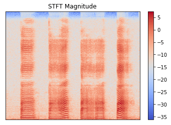
2.用scipy库
plt.figure()
f, t, Zxx = signal.stft(x, fs=fs,window='hann',nperseg=fftlen,noverlap=None,nfft=None,
detrend=False,return_onesided=True,boundary='zeros',padded=True,axis=-1)
plt.pcolormesh(t, f, np.log(np.abs(Zxx)))
plt.title('STFT Magnitude')
plt.ylabel('Frequency [Hz]')
plt.xlabel('Time [sec]')
若不进行log:
大概可以看到一些纹理,但不是很清晰。下面进行log后:
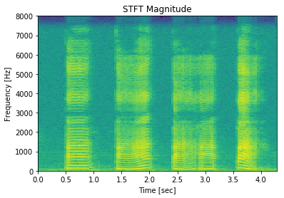
此时和上面的语谱图很相似,甚至基本一样。
把频谱通过梅尔标度滤波器组(mel-scale filter banks),变换为梅尔频谱。下面选了128个mel bands。
melspec = librosa.feature.melspectrogram(x, sr=fs, n_fft=fftlen, hop_length=hop_length, n_mels=128) #(128,856)
logmelspec = librosa.power_to_db(melspec)# (128,856)
plt.figure()
librosa.display.specshow(logmelspec, sr=fs, x_axis='time', y_axis='mel')
plt.title('log melspectrogram')
plt.show()
可以看到,通过mel滤波器组后,还有转换到log域,即 power_to_db,也就是10*log10|melspec|,这步很关键。此时得到的梅尔语谱图如下:

若不进行power_to_db这步,会怎样呢?改成下面:
librosa.display.specshow(melspec, sr=fs, x_axis='time', y_axis='mel')
就是这样,目测不出太多信息,为什么呢?
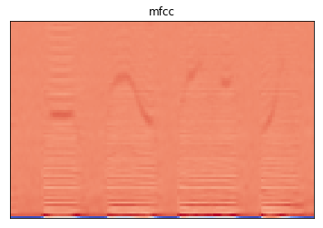
再复习一下梅尔倒谱系数提取流程:
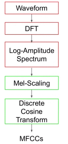
mfccs = librosa.feature.mfcc(x, sr=fs, n_mfcc=80)
plt.figure()
librosa.display.specshow(mfccs, sr=fs)
plt.title('mfcc')
plt.show()
mfcc函数的主要内容如下:
def mfcc(y=None, sr=22050, S=None, n_mfcc=20, **kwargs):if S is None:S = power_to_db(melspectrogram(y=y, sr=sr, **kwargs))return np.dot(filters.dct(n_mfcc, S.shape[0]), S)


 京公网安备 11010802041100号 | 京ICP备19059560号-4 | PHP1.CN 第一PHP社区 版权所有