布局1. 盒模型重置
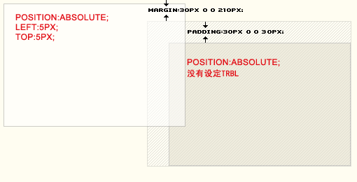
盒模型重置,使盒子的宽度和高度不受其边框(border)或填充(padding)的影响。
HTML
border-box
content-box
CSS
html { box-sizing: border-box;}*,*::before,*::after { box-sizing: inherit;}.box { display: inline-block; width: 150px; height: 150px; padding: 10px; background: tomato; color: white; border: 10px solid red;}.content-box { box-sizing: content-box;}
DEMO
可在 CodePen 上查看真实效果和编辑代码
说明
- box-sizing:当元素设置为border-box时,即便设置了padding或border也不会改变元素的宽度和高度。
- box-sizing:设置inherit使元素继承父级的box-sizing规则。
浏览器支持情况
99.9% 查看本条 caniuse
2. 清除浮动更好的方式
无需借助辅助元素进行浮动的清除。
注意:这仅在使用float布局时才有用。实际场景中请考虑使用Flexbox布局或者网格布局。
HTML
CSS
.clearfix{ border:solid 1px red;}.clearfix::after { content: ''; display: block; clear: both;}.floated { float: left; margin-left:20px;}
DEMO
可在 CodePen 上查看真实效果和编辑代码
浏览器支持情况
100%
我自己是一名从事了多年开发的web前端老程序员,目前辞职在做自己的web前端私人定制课程,今年年初我花了一个月整理了一份最适合2019年学习的web前端学习干货,各种框架都有整理,送给每一位前端小伙伴,想要获取的可以关注我的头条号并在后台私信我:前端,即可免费获取。
3. 不变宽高比
给定宽度可变的元素,它将确保其高度以响应方式保持成比例(即,其宽高比保持不变)。
DEMO
可在 CodePen 上查看真实效果和编辑代码
HTML
CSS
.constant-width-to-height-ratio { background: #333; width: 50%;}.constant-width-to-height-ratio::before { content: ''; padding-top: 100%; float: left;}.constant-width-to-height-ratio::after { content: ''; display: block; clear: both;}
说明
- width:50% 只设置父级元素的宽度
- ::before 为父级元素定义一个伪元素
- padding-top:100%; 设置伪元素的内上边距,这里的百分比的值是按照宽度计算的,所以会呈现为一个响应式的元素块。
- 此方法还允许将内容正常放置在元素内。
浏览器支持情况
100%
4.使用表格居中
使用display:table(作为flexbox的替代)使子元素在其父元素中水平垂直居。
HTML
CSS
.container { border: 1px solid #333; height: 250px; width: 250px;}.center { display: table; height: 100%; width: 100%;}.center > span { display: table-cell; text-align: center; vertical-align: middle;}
DEMO
可在 CodePen 上查看真实效果和编辑代码
- display:table 使.center元素的行为类似于 HTML元素。
- 设置.center的宽高为100%,使其填满父元素。
- display:table-cell, 设置'.center > span'的table-cell允许元素表现得像HTML元素。
- text-align: center 使子元素水平居中。
- vertical-align: middle 使子元素垂直居中。
- 外部父级必须有固定的宽高。浏览器支持情况100%查看本条 caniuse
5. 使子元素均匀分布HTML Item1
Item2
Item3
.evenly-distributed-children {display: flex;justify-content: space-between;}DEMO可在 CodePen 上查看真实效果和编辑代码
说明- display: flex :启动flex 布局
- justify-content: space-between:
- 均匀地水平分配子元素。第一个子元素位于左边缘,而最后一个子元素位于右边缘。或者,使用justify-content:space-around来分配子节点周围的空间,而不是它们之间。
浏览器支持情况99.5%
6. 让图片在容器中显示的更舒适设置图像在其容器内的适合度和位置,同时保留其宽高比。以前只能使用背景图像和background-size属性来实现。HTML

CSS.image {background: #34495e;border: 1px solid #34495e;width: 200px;height: 200px;}.image-contain {object-fit: contain;object-position: center;}.image-cover {object-fit: cover;object-position: right top;}DEMO可在 CodePen 上查看真实效果和编辑代码
说明- object-fit:contain 容器内显示整个图像,并且保持宽高比
- object-fit:cover 用图像填充容器,并保持宽高比
- object-position:[x][y] 对图像的显示部位进行调整
浏览器支持程度95.5% caniuse7. 使用 flexbox 居中使用 flexbox 水平垂直居中其子元素HTML
CSS.flexbox-centering {display: flex;justify-content: center;align-items: center;height: 100px;}DEMO可在 CodePen 上查看真实效果和编辑代码
说明- display:flex 启用 flex 局部
- justify-content:center 子元素水平居中
- align-items:center 子元素垂直居中
浏览器支持程度99.5% (需要使用前缀) caniuse8.将元素垂直居中于另一个元素。HTML
Vertically centered without changing the position property.
CSS.ghosting {height: 300px;background: #0ff;}.ghosting:before {content: '';display: inline-block;height: 100%;vertical-align: middle;}p {display: inline-block;vertical-align: middle;}DEMO可在 CodePen 上查看真实效果和编辑代码
说明使用 :before伪元素的样式垂直对齐内联元素而不更改其position属性。
浏览器支持程度99.9% caniuse9. 使用网格居中使用网格水平垂直居中子元素.HTML
CSS.grid-centering {display: grid;justify-content: center;align-items: center;height: 100px;}DEMO可在 CodePen 上查看真实效果和编辑代码
说明- display:grid 启用网格布局
- justify-content:center 使子元素水平居中
- align-items:center 使子元素垂直居中
浏览器支持程度92.3% caniuse10. 使最后一项占满剩余高度通过为最后一个元素提供当前视口中剩余的可用空间,即使在调整窗口大小时,也可以利用可用的视口空间。HTML
Div 2
Div 3
CSShtml,body {height: 100%;margin: 0;}.container {height: 100%;display: flex;flex-direction: column;}.container > div:last-child {background-color: tomato;flex: 1;}DEMO可在 CodePen 上查看真实效果和编辑代码
说明- height:100% 将容器的高度设为视口的高度
- display:flex 启用 flex
- flex-direction:column 将项目的顺序设置成从上到下
- flex-grow:1 flexbox会将容器的剩余可用空间应用于最后一个子元素。父级必须具有视口高度。flex-grow:1可以应用于第一个或第二个元素,它将具有所有可用空间。
浏览器支持程度99.5% 需要使用前缀 caniuse11. 屏外隐藏元素HTMLLearn More
about pantsCSS.offscreen {border: 0;clip: rect(0 0 0 0);height: 1px;margin: -1px;overflow: hidden;padding: 0;position: absolute;width: 1px;}DEMO可在 CodePen 上查看真实效果和编辑代码
说明- 删除所有边框
- 使用 clip 隐藏元素
- 设置宽高为1px
- 使用margin:-1px取消元素的高度和宽度
- 隐藏元素的溢出
- 移除所有的padding
- 绝对定位元素,使其不占用DOM中的空间
- *
浏览器支持程度100% 需要使用前缀 caniuse(虽然cilp已被废弃,但较新的clip-path 目前对浏览器的支持非常有限。)12. 使用transform居中子元素使用 position:absoluteandtransform:translate() 进行居中,不需要知道父级和子元素的宽高,因此它非常适合响应式应用程序。HTML
CSS.parent {border: 1px solid #333;height: 250px;position: relative;width: 250px;}.child {left: 50%;position: absolute;top: 50%;transform: translate(-50%, -50%);text-align: center;}DEMO可在 CodePen 上查看真实效果和编辑代码
浏览器支持程度97.7% 需要使用前缀 caniuse视觉13.多行文本截断显示如果文本长于一行,则将截断n行,并以渐变结束。HTMLLorem ipsum dolor sit amet, consetetur sadipscing elitr, sed diam nonumy eirmod tempor invidunt utlabore et.CSS.truncate-text-multiline {overflow: hidden;display: block;height: 109.2px;margin: 0 auto;font-size: 26px;line-height: 1.4;width: 400px;position: relative;}.truncate-text-multiline:after {content: '';position: absolute;bottom: 0;right: 0;width: 150px;height: 36.4px;background: linear-gradient(to right, rgba(0, 0, 0, 0), #f5f6f9 50%);}DEMO可在 CodePen 上查看真实效果和编辑代码
说明- overflow:hidden 防止内容溢出
- width:400px 确保元素有尺寸
- height:109.2px 计算的高度值,它等于font-size * line-height * numberOfLines(在这种情况下为26 * 1.4 * 3 = 109.2)
- height:36.4px 渐变容器的计算值,它等于font-size * line-height(在这种情况下为26 * 1.4 = 36.4)
- background:linear-gradient(to right,rgba(0,0,0,0),#f5f6f9 50% 渐变从 透明到渐变从透明到 #f5f6f9
浏览器支持程度97.5% caniuse14. 画一个圆使用纯CSS创建圆形。HTMLCSS.circle {border-radius: 50%;width: 2rem;height: 2rem;background: #333;}DEMO可在 CodePen 上查看真实效果和编辑代码
浏览器支持程度97.7% caniuse15. 列表计数器计数器本质上是由CSS维护的变量,其值可以通过CSS规则递增以跟踪它们被使用的次数。HTMLList itemList itemList itemList itemList itemList itemCSSul {counter-reset: counter;}li::before {counter-increment: counter;content: counters(counter, '.') ' ';}DEMO可在 CodePen 上查看真实效果和编辑代码
说明你现在可以使用任何类型的html 标签创建有序列表。
- counter-reset 初始化计数器,该值是计数器的名称。默认情况下,计数器从0开始。此属性还可用于将其值更改为任何特定数字。
- counter-increment 用于可数的元素。一旦计数器重置初始化,计数器的值可以增加或减少。
- counter(name,style)显示节计数器的值。通常用于内容属性。此函数可以接收两个参数,第一个作为计数器的名称,第二个参数表示占位内容,例如 3.1的小数点。
- CSS计数器对于制作轮廓列表特别有用,因为计数器的新实例是在子元素中自动创建的。使用counters()函数,可以在不同级别的嵌套计数器之间插入分隔文本。
浏览器支持程度99.9% caniuse16.自定义滚动条HTML
Lorem ipsum dolor sit amet consectetur adipisicing elit.Iure id exercitationem nulla qui repellat laborum vitae, molestias tempora velit natus. Quas, assumenda nisi. Quisquam enim qui iure, consequatur velit sit?CSS.custom-scrollbar {height: 70px;overflow-y: scroll;}/* To style the document scrollbar, remove `.custom-scrollbar` */.custom-scrollbar::-webkit-scrollbar {width: 8px;}.custom-scrollbar::-webkit-scrollbar-track {box-shadow: inset 0 0 6px rgba(0, 0, 0, 0.3);border-radius: 10px;}.custom-scrollbar::-webkit-scrollbar-thumb {border-radius: 10px;box-shadow: inset 0 0 6px rgba(0, 0, 0, 0.5);}DEMO可在 CodePen 上查看真实效果和编辑代码
浏览器支持程度90.7% caniuse17. 自定义文本选择的样式HTML
Select some of this text.
CSS::selection {background: aquamarine;color: black;}.custom-text-selection::selection {background: deeppink;color: white;}DEMO可在 CodePen 上查看真实效果和编辑代码
浏览器支持程度86.5% caniuse18. 创建动态阴影创建类似于box-shadow的阴影,但基于元素本身的颜色。HTMlCSS.dynamic-shadow {position: relative;width: 10rem;height: 10rem;background: linear-gradient(75deg, #6d78ff, #00ffb8);z-index: 1;}.dynamic-shadow::after {content: '';width: 100%;height: 100%;position: absolute;background: inherit;top: 0.5rem;filter: blur(0.4rem);opacity: 0.7;z-index: -1;}DEMO可在 CodePen 上查看真实效果和编辑代码
说明- ::after 定义一个伪元素
- position:absolute 使伪元素脱离文档流并相对于父级定位
- width:100%andheight:100% 对伪元素进行大小调整以填充其父元素的大小,使其大小相等。
- background:inherit 使伪元素继承父级的线性渐变
- top:0.5rem 将伪元素相对于其父元素略微偏移。
- filter:blur(0.4rem) 设置伪元素模糊效果,以创建下方阴影效果。
- opacity:0.7 设置伪元素透明度
- z-index:-1 将伪元素定位在父元素后面但在背景前面。
浏览器支持程度94.2% 需要使用前缀 caniuse19. 蚀刻文字效果创建一种效果,其中文本看起来像“蚀刻”或雕刻在背景中。HTML
I appear etched into the background.
CSS.etched-text {text-shadow: 0 2px white;font-size: 1.5rem;font-weight: bold;color: #b8bec5;}DEMO可在 CodePen 上查看真实效果和编辑代码
说明- text-shadow:02pxwhite 从原点位置创建一个水平偏移0px和垂直偏移2px的白色阴影。
- 背景必须比阴影更暗,效果才更明显。
浏览器支持程度99.5% 需要使用前缀 caniuse20. Focus Within 伪类如果表单中的任何子项被聚焦,则更改表单的外观。HTML
Given Name: Family Name: CSSform {border: 3px solid #2d98da;color: #000000;padding: 4px;}form:focus-within {background: #f7b731;color: #000000;}DEMO可在 CodePen 上查看真实效果和编辑代码
说明- 伪类::focus-within 将对应的样式应用于父元素(任何子元素被聚焦)。例如,表单元素内的输入元素。
浏览器支持程度82.9% IE11或当前版本的Edge不支持。caniuse21. 指定元素的全屏:fullsrcreen 全屏伪类表示浏览器处于全屏模式时显示的元素。HTML
Click the button below to enter the element into fullscreen mode.
I change color in fullscreen mode!
Go Full Screen!CSS.container {margin: 40px auto;max-width: 700px;}.element {padding: 20px;height: 300px;width: 100%;background-color: skyblue;}.element p {text-align: center;color: white;font-size: 3em;}.element:-ms-fullscreen p {visibility: visible;}.element:fullscreen {background-color: #e4708a;width: 100vw;height: 100vh;}DEMO可在 CodePen 上查看真实效果和编辑代码
说明- :fullscreen 伪类选择器用于选择和设置以全屏模式显示的元素。
浏览器支持程度85.6%属性详解caniuse22.渐变文字为文本提供渐变颜色。HTML
Gradient text
CSS.gradient-text {background: -webkit-linear-gradient(pink, red);-webkit-text-fill-color: transparent;-webkit-background-clip: text;}DEMO可在 CodePen 上查看真实效果和编辑代码
浏览器支持程度94.1%caniuse23. 渐变跟踪一种悬停效果,其中渐变跟随鼠标光标。HTML
Hover me I'm awesomeCSSbody {display: flex;justify-content: center;align-items: center;min-height: 100vh;background: white;}.button {position: relative;appearance: none;background: #f72359;padding: 1em 2em;border: none;color: white;font-size: 1.2em;cursor: pointer;outline: none;overflow: hidden;border-radius: 100px;span {position: relative;pointer-events: none;}&::before {--size: 0;content: '';position: absolute;left: var(--x);top: var(--y);width: var(--size);height: var(--size);background: radial-gradient(circle closest-side, #4405f7, transparent);transform: translate(-50%, -50%);transition: width .2s ease, height .2s ease;}&:hover::before {--size: 400px;}}document.querySelector('.button').onmousemove = (e) => {const x = e.pageX - e.target.offsetLeftconst y = e.pageY - e.target.offsetTope.target.style.setProperty('--x', `${ x }px`)e.target.style.setProperty('--y', `${ y }px`)}DEMO可在 CodePen 上查看真实效果和编辑代码
浏览器支持程度91.6% 需要使用 js caniuse24. :not 伪类选择器:not 伪选择器对于设置一组元素的样式非常有用,同时保留最后一个(指定的)元素的样式。HTMLOneTwoThreeFourCSS.css-not-selector-shortcut {display: flex;}ul {padding-left: 0;}li {list-style-type: none;margin: 0;padding: 0 0.75rem;}li:not(:last-child) {border-right: 2px solid #d2d5e4;}DEMO可在 CodePen 上查看真实效果和编辑代码
说明- li:not(:last-child) 设置除last:child之外的所有li元素的样式,所以最后一个元素右侧没有 border.
浏览器支持程度99.9% caniuse25.溢出滚动渐变给溢出元素添加渐变,以更好地指示要滚动的内容。HTLM
Iure id exercitationem nulla qui repellat laborum vitae, molestias tempora velit natus. Quas, assumenda nisi. Quisquam enim qui iure, consequatur velit sit? Lorem ipsum dolor sit amet consectetur adipisicing elit.Iure id exercitationem nulla qui repellat laborum vitae, molestias tempora velit natus. Quas, assumenda nisi. Quisquam enim qui iure, consequatur velit sit?CSS.overflow-scroll-gradient {position: relative;}.overflow-scroll-gradient::after {content: '';position: absolute;bottom: 0;width: 240px;height: 25px;background: linear-gradient(rgba(255, 255, 255, 0.001),white); /* transparent keyword is broken in Safari */pointer-events: none;}.overflow-scroll-gradient__scroller {overflow-y: scroll;background: white;width: 240px;height: 200px;padding: 15px;line-height: 1.2;}DEMO
说明- ::after 定义一个伪元素用来展示渐变效果
- background-image:linear-gradient(...) 添加一个从透明变为白色(从上到下)的线性渐变。
- pointer-events:none 指定伪元素不能是鼠标事件的目标,后面的文本仍然是可选择/交互的。
浏览器支持程度97.5% caniuse26.给文字添加漂亮的下划线HTML
Pretty text underline without clipping descending letters.
CSS.pretty-text-underline {display: inline;text-shadow: 1px 1px #f5f6f9, -1px 1px #f5f6f9, -1px -1px #f5f6f9, 1px -1px #f5f6f9;background-image: linear-gradient(90deg, currentColor 100%, transparent 100%);background-position: bottom;background-repeat: no-repeat;background-size: 100% 1px;}.pretty-text-underline::-moz-selection {background-color: rgba(0, 150, 255, 0.3);text-shadow: none;}.pretty-text-underline::selection {background-color: rgba(0, 150, 255, 0.3);text-shadow: none;}DEMOCodePen上查看和编辑代码浏览器支持程度97.5% caniuse1 caniuse227. 重置所有样式使用一个属性将所有样式重置为默认值。这不会影响 direction和 unicode-bidi属性。HTML
Title
Lorem ipsum dolor sit amet consectetur adipisicing elit. Iure id exercitationem nulla quirepellat laborum vitae, molestias tempora velit natus. Quas, assumenda nisi. Quisquam enim quiiure, consequatur velit sit?CSS.reset-all-styles {all: initial;}DEMOCodePen上查看和编辑代码
说明all 属性允许您将所有样式(继承或不继承)重置为默认值。浏览器支持程度91.2% caniuse28. 形状分隔符使用SVG形状分割两个不同的块以创建更有趣的视觉外观。HTMLCSS.shape-separator {position: relative;height: 48px;background: #333;}.shape-separator::after {content: '';background-image: url("data:image/svg+xml,%3Csvg xmlns='http://www.w3.org/2000/svg' viewBox='0 0 24 12'%3E%3Cpath d='m12 0l12 12h-24z' fill='%23fff'/%3E%3C/svg%3E");position: absolute;width: 100%;height: 12px;bottom: 0;}DEMOCodePen上查看和编辑代码
说明- background-image:url(...)添加SVG形状(24x12三角形)作为伪元素的背景图像,默认情况下重复。它必须与要分割的块颜色相同。对于其他形状,我们可以使用SVG的URL编码器。
浏览器支持程度99.7% caniuse29. 系统字体HTML
This text uses the system font.
CSS.system-font-stack {font-family: -apple-system, BlinkMacSystemFont, 'Segoe UI', Roboto, Oxygen-Sans, Ubuntu,Cantarell, 'Helvetica Neue', Helvetica, Arial, sans-serif;}DEMOCodePen上查看和编辑代码
说明浏览器会对字体进行逐个查找,如果找到的话就是用当前的,如果找不到字体(在系统上或在CSS中定义),则继续往后查找。
- -apple-system在iOS和macOS上使用(但不是Chrome)
- BlinkMacSystemFont 用于macOS Chrome
- SegoeUI 用于Windows 10
- Roboto 在Android上使用
- Oxygen-Sans 在Linux KDE上使用
- Ubuntu 用于Ubuntu
- Cantarell 在GNOME Shell的Linux上使用
- HelveticaNeueandHelvetica 用于macOS 10.10及更低版本
- Arial 操作系统广泛支持的字体
- sans-serif 如果不支持其他任何字体,则降级使用 sans-serif 通用字体
浏览器支持程度 100%30. css 开关只使用 css 来实现HTMlCSS.switch {position: relative;display: inline-block;width: 40px;height: 20px;background-color: rgba(0, 0, 0, 0.25);border-radius: 20px;transition: all 0.3s;}.switch::after {content: '';position: absolute;width: 18px;height: 18px;border-radius: 18px;background-color: white;top: 1px;left: 1px;transition: all 0.3s;}input[type='checkbox']:checked + .switch::after {transform: translateX(20px);}input[type='checkbox']:checked + .switch {background-color: #7983ff;}.offscreen {position: absolute;left: -9999px;}DEMOCodePen上预览和编辑代码浏览器支持程度
97.7% 需要使用前缀caniuse31. 用 css 画一个三角形HTMLCSS.triangle {width: 0;height: 0;border-top: 20px solid #333;border-left: 20px solid transparent;border-right: 20px solid transparent;}DEMOCodePen上预览和编辑代码浏览器支持程度 100%;32. 斑马条纹列表创建具有交替背景颜色的列表,这对于区分各行间的内容很有用。HTMLItem 01Item 02Item 03Item 04Item 05CSSli:nth-child(odd) {background-color: #eee;}DEMOCodePen上预览和编辑代码浏览器支持程度 99.9% caniuse动画33.弹跳 loading 动画HTMLCSS@keyframes bouncing-loader {to {opacity: 0.1;transform: translate3d(0, -1rem, 0);}}.bouncing-loader {display: flex;justify-content: center;}.bouncing-loader > div {width: 1rem;height: 1rem;margin: 3rem 0.2rem;background: #8385aa;border-radius: 50%;animation: bouncing-loader 0.6s infinite alternate;}.bouncing-loader > div:nth-child(2) {animation-delay: 0.2s;}.bouncing-loader > div:nth-child(3) {animation-delay: 0.4s;}DEMOCodePen上预览和编辑代码浏览器支持程度97.4% caniuse34. 按钮边框动画创建一个鼠标悬停的边框动画HTML
Submit
CSS.button {background-color: #c47135;border: none;color: #ffffff;outline: none;padding: 12px 40px 10px;position: relative;}.button:before,.button:after {border: 0 solid transparent;transition: all 0.25s;content: '';height: 24px;position: absolute;width: 24px;}.button:before {border-top: 2px solid #c47135;left: 0px;top: -5px;}.button:after {border-bottom: 2px solid #c47135;bottom: -5px;right: 0px;}.button:hover {background-color: #c47135;}.button:hover:before,.button:hover:after {height: 100%;width: 100%;}DEMOCodePen上预览和编辑代码
说明使用:before和:after伪元素作为在悬停时设置动画的边框。浏览器支持程度 100%.35.甜甜圈旋转器创建一个甜甜圈旋转器,可用于等待内容的加载。DEMOHTMLCSS@keyframes donut-spin {0% {transform: rotate(0deg);}100% {transform: rotate(360deg);}}.donut {display: inline-block;border: 4px solid rgba(0, 0, 0, 0.1);border-left-color: #7983ff;border-radius: 50%;width: 30px;height: 30px;animation: donut-spin 1.2s linear infinite;}CodePen上预览和编辑代码
说明对于整个元素使用半透明边框,然后设置一侧的边框颜色 border-left-color:#7983ff;,最后使用动画旋转整个元素。浏览器支持程度* 97.4%* 需要使用前缀。caniuse1 https://caniuse.com/#feat=transforms2dcaniuse2 feat=transforms2d36.缓动效果DEMOHTML
Hover
CSS:root {/* Place variables in here to use globally */}.easing-variables {--ease-in-quad: cubic-bezier(0.55, 0.085, 0.68, 0.53);--ease-in-cubic: cubic-bezier(0.55, 0.055, 0.675, 0.19);--ease-in-quart: cubic-bezier(0.895, 0.03, 0.685, 0.22);--ease-in-quint: cubic-bezier(0.755, 0.05, 0.855, 0.06);--ease-in-expo: cubic-bezier(0.95, 0.05, 0.795, 0.035);--ease-in-circ: cubic-bezier(0.6, 0.04, 0.98, 0.335);--ease-out-quad: cubic-bezier(0.25, 0.46, 0.45, 0.94);--ease-out-cubic: cubic-bezier(0.215, 0.61, 0.355, 1);--ease-out-quart: cubic-bezier(0.165, 0.84, 0.44, 1);--ease-out-quint: cubic-bezier(0.23, 1, 0.32, 1);--ease-out-expo: cubic-bezier(0.19, 1, 0.22, 1);--ease-out-circ: cubic-bezier(0.075, 0.82, 0.165, 1);--ease-in-out-quad: cubic-bezier(0.455, 0.03, 0.515, 0.955);--ease-in-out-cubic: cubic-bezier(0.645, 0.045, 0.355, 1);--ease-in-out-quart: cubic-bezier(0.77, 0, 0.175, 1);--ease-in-out-quint: cubic-bezier(0.86, 0, 0.07, 1);--ease-in-out-expo: cubic-bezier(1, 0, 0, 1);--ease-in-out-circ: cubic-bezier(0.785, 0.135, 0.15, 0.86);display: inline-block;width: 75px;height: 75px;padding: 10px;color: white;line-height: 50px;text-align: center;background: #333;transition: transform 1s var(--ease-out-quart);}.easing-variables:hover {transform: rotate(45deg);}CodePen上预览和编辑代码浏览器支持程度* 91.6% * caniuse css-variables37.高度过度当元素的高度未知时,将元素的高度从0转换为自动。DEMOCodePen上预览和编辑代码HTML
Hover me to see a height transition.
content
CSS.el {transition: max-height 0.5s;overflow: hidden;max-height: 0;}.trigger:hover > .el {max-height: var(--max-height);}Javascriptvar el = document.querySelector('.el')var height = el.scrollHeightel.style.setProperty('--max-height', height + 'px')
说明浏览器支持程度
91.6% caniuse css-variables
- 注意:将会导致所有动画帧重排,过度中如果元素下方有大量元素,则可能会出现滞后现象。
caninuse - css-variablescaninuse - css-transitions38.悬停阴影动画在文本上悬停时,在文本周围创建一个阴影框动画效果。动画效果可在CodePen上预览和编辑代码HTML
Box it!
CSS.hover-shadow-box-animation {display: inline-block;vertical-align: middle;transform: perspective(1px) translateZ(0);box-shadow: 0 0 1px transparent;margin: 10px;transition-duration: 0.3s;transition-property: box-shadow, transform;}.hover-shadow-box-animation:hover,.hover-shadow-box-animation:focus,.hover-shadow-box-animation:active {box-shadow: 1px 10px 10px -10px rgba(0, 0, 24, 0.5);transform: scale(1.2);}浏览器支持程度
97.3%caniuse - feat-transforms3dcaniuse - css-transitions39.悬停下滑线动画当文本悬停时,创建文本下划线动画效果。DEMO动画效果可在CodePen上预览和编辑代码HTML
Hover this text to see the effect!
CSS.hover-underline-animation {display: inline-block;position: relative;color: #0087ca;}.hover-underline-animation::after {content: '';position: absolute;width: 100%;transform: scaleX(0);height: 2px;bottom: 0;left: 0;background-color: #0087ca;transform-origin: bottom right;transition: transform 0.25s ease-out;}.hover-underline-animation:hover::after {transform: scaleX(1);transform-origin: bottom left;}
说明- display:inline-block 使p成为内联块,以防止下划线跨越整行宽度而不仅仅是文本内容。
- position:relative 设置父元素为相对定位
- ::after 定义一个伪元素
- position:absolute 将伪元素脱离文档六,并将其相对于父元素定位
- width:100% 确保伪元素和父元素的宽度一致。
- transform:scaleX(0) 最初将伪元素缩放为0,因此他是看不见的。
- bottom:0andleft:0 将伪元素放在父元素的左下角。
- transition:transform0.25sease-out 设置动画效果为 ease-out,并且在0.25秒内完成。
- transform-origin:bottom right 变换中心点到父元素的右下角。
- :hover::after 然后使用scaleX(1)将宽度转换为100%,然后将中心点更改为左下角,允许它在悬停时从另一个方向转换出来。
浏览器支持程度
97.5%caniuse - feat=transforms2dcaniuse - css-transitions交互40. 禁用选择使用 css 让内容无法选取。DEMO可在CodePen上预览效果和编辑代码HTML
You can select me.
You can't select me!
CSS.unselectable {user-select: none;}
说明user-select:none 指定无法选择文本浏览器支持程度
93.2% (需要使用前缀,这并不是防止用户复制内容的安全方法。)caniuse - feat=user-select-none41. 弹出菜单在悬停和焦点上弹出交互式菜单。可在CodePen上预览效果和编辑代码HTML
CSS.reference {position: relative;background: tomato;width: 100px;height: 100px;}.popout-menu {position: absolute;visibility: hidden;left: 100%;background: #333;color: white;padding: 15px;}.reference:hover > .popout-menu,.reference:focus > .popout-menu,.reference:focus-within > .popout-menu {visibility: visible;}
说明- left:100% 弹出菜单从左侧偏移其父级宽度的100%。
- visibility:hidden
- .reference:hover>.popout-menu 鼠标悬停时,.popout-menu 显示
- .reference:focus>.popout-menu 聚焦时,.popout-menu 显示
- .reference:focus-within>.popout-menu 确保在焦点位于参考范围内时显示弹出窗口。
- *
浏览器支持程度 100%;42.兄弟元素淡化悬停时兄弟节点淡化显示.DEMO可在CodePen上预览效果和编辑代码HTML
Item 1 Item 2 Item 3 Item 4
Item 5
Item 6CSSspan {padding: 0 1rem;transition: opacity 0.2s;}.sibling-fade:hover span:not(:hover) {opacity: 0.5;}
说明- transition:opacity0.2s 设置0.2秒的淡化动画。
- .sibling-fade:hover span:not(:hover)当父级悬停时,选择当前未悬停的span子项并将其透明度更改为0.5。
浏览器支持程度 97.5%;caniuse-feat=css-sel3caniuse-feat=css-transitions其他43. 计算函数 Calc()函数calc()允许使用数学表达式定义CSS值,属性采用的值是数学表达式的结果。DEMO可在CodePen上预览效果和编辑代码如果你想在右侧和底部对齐背景图像,则只能使用直线长度值。所以现在可以使用calc()函数.HTMLCSS.box-example {height: 280px;background: #222 url('https://image.ibb.co/fUL9nS/wolf.png') no-repeat;background-position: calc(100% - 20px) calc(100% - 20px);}
说明- 允许加法,减法,乘法和除法。
- 可以为表达式中的每个值使用不同的单位(例如,像素和百分比)。
- 允许嵌套calc()函数。
- 它可用于任何允许,,,,,或的属性,如width,height,font-size,top等。
- *
浏览器支持程度 97.0%caniuse - feat=calc44. css 自定义变量包含要重用的特定值的CSS变量。HTML
CSS is awesome!
CSS:root {/* Place variables within here to use the variables globally. */}.custom-variables {--some-color: #da7800;--some-keyword: italic;--some-size: 1.25em;--some-complex-value: 1px 1px 2px whitesmoke, 0 0 1em slategray, 0 0 0.2em slategray;color: var(--some-color);font-size: var(--some-size);font-style: var(--some-keyword);text-shadow: var(--some-complex-value);}DEMO可在CodePen上预览效果和编辑代码
说明- --variable-name: 用这样的格式来声明变量。
- var(--variable-name) 使用此函数在整个文档中重用变量。
浏览器支持程度 91.6%caniuse - feat=css-variables
原文链接:https://mp.weixin.qq.com/s/Pw3VgFpijTYRkJyYPvlJgA
作者:前端技术江湖


 京公网安备 11010802041100号 | 京ICP备19059560号-4 | PHP1.CN 第一PHP社区 版权所有