CSS3 clock. Today – another one great article – we are going to create pure CSS3 Analog Clock without any Javascript (we are going to use power of CSS3 with animations to build it). Our clocks have three arrows on the face – hour, minute and second. Each of them – a narrow rectangle rotated to the desired angle. How it works in result? – Easy, I am using necessary delays for all these arrows. How exactly – read on.
CSS3时钟。 今天(另一篇很棒的文章),我们将创建不带任何Javascript的纯CSS3模拟时钟(我们将使用CSS3的强大功能和动画来构建它)。 我们的钟面上有三个箭头–小时,分钟和秒。 他们每个人-旋转到所需角度的狭窄矩形。 结果如何运作? –很简单,我为所有这些箭头使用了必要的延迟。 究竟如何–继续阅读。
For our clock – I have prepared -webkit and -moz styles. So please keep in mind – that clock will work only in Firefox, and Webkit-based browsers (Chrome and Safari). If you like – you always can expand necessary styles (for arrows) for IE and Opera browsers (by adding same stylesheets with -ms and -o prefixes).
对于我们的时钟,我准备了-webkit和-moz样式。 因此请记住-该时钟仅在Firefox和基于Webkit的浏览器(Chrome和Safari)中有效。 如果愿意,您可以始终为IE和Opera浏览器扩展必要的样式(箭头)(通过添加带有-ms和-o前缀的相同样式表)。
Here are samples and downloadable package:
以下是示例和可下载的软件包:
Ok, download the example files and lets start coding !
好的,下载示例文件并开始编码!
The mark-up for our clock is not very simple – it contain lot of DIV elements. Each of them – our arrows. Here it is.
我们时钟的标记不是很简单-它包含许多DIV元素。 每个人-我们的箭。 这里是。
Analog Clock with Pure CSS3 (without Javascript)
Back to original tutorial on Script Tutorials
Analog Clock with Pure CSS3 (without Javascript)
Back to original tutorial on Script Tutorials
Now – CSS styles. As usual, we won’t publish main page layout styles (layout.css). But, there are stylesheets for our clock:
现在-CSS样式。 和往常一样,我们不会发布主页布局样式(layout.css)。 但是,我们的时钟有一些样式表:
#clock {background: #fff url(cface.png) 0 0 no-repeat;height: 500px;margin: 0 auto;overflow: hidden;position: relative;width: 500px;-webkit-border-radius: 250px;-moz-border-radius: 250px;-ms-border-radius: 250px;-o-border-radius: 250px;border-radius: 250px;
}
/* seconds */
@-webkit-keyframes secs_effect {0% {opacity: 1;}1.66% {opacity: 1;}1.67% {opacity: 0;}100% {opacity: 0;}
}
@-moz-keyframes secs_effect {0% {opacity: 1;}1.66% {opacity: 1;}1.67% {opacity: 0;}100% {opacity: 0;}
}
#clock  .secs {height: 400px;left: 155px;position: absolute;top: 249px;width: 400px;
}
#clock  .secs div {background-color: #860000;height: 2px;opacity: 0;position: absolute;width: 190px;-moz-animation-name: secs_effect;-moz-animation-duration: 60s;-moz-animation-timing-function: linear;-moz-animation-iteration-count: infinite;-moz-animation-direction: normal;-moz-animation-delay: 0;-moz-animation-play-state: running;-moz-animation-fill-mode: forwards;-webkit-animation-name: secs_effect;-webkit-animation-duration: 60s;-webkit-animation-timing-function: linear;-webkit-animation-iteration-count: infinite;-webkit-animation-direction: normal;-webkit-animation-delay: 0;-webkit-animation-play-state: running;-webkit-animation-fill-mode: forwards;
}
#clock #s1 {
-moz-transform: rotate(-90deg) translatex(130px);
-moz-animation-delay: 0s;
-webkit-transform: rotate(-90deg) translatex(130px);
-webkit-animation-delay: 0s;
}
#clock #s2 {
-moz-transform: rotate(-84deg) translatex(130px);
-moz-animation-delay: 1s;
-webkit-transform: rotate(-84deg) translatex(130px);
-webkit-animation-delay: 1s;
}
#clock #s3 {
-moz-transform: rotate(-78deg) translatex(130px);
-moz-animation-delay: 2s;
-webkit-transform: rotate(-78deg) translatex(130px);
-webkit-animation-delay: 2s;
}
...........
#clock #s60 {
-moz-transform: rotate(264deg) translatex(130px);
-moz-animation-delay: 59s;
-webkit-transform: rotate(264deg) translatex(130px);
-webkit-animation-delay: 59s;
}
/* minutes */
@-webkit-keyframes mins_effect {0% {opacity: 1;}1.66% {opacity: 1;}1.67% {opacity: 0;}100% {opacity: 0;}
}
@-moz-keyframes mins_effect {0% {opacity: 1;}1.66% {opacity: 1;}1.67% {opacity: 0;}100% {opacity: 0;}
}
#clock  .mins {height: 300px;left: 175px;position: absolute;top: 249px;width: 300px;
}
#clock  .mins div {background-color: #000086;height: 3px;opacity: 0;position: absolute;width: 150px;-moz-animation-name: mins_effect;-moz-animation-duration: 3600s;-moz-animation-timing-function: linear;-moz-animation-iteration-count: infinite;-moz-animation-direction: normal;-moz-animation-delay: 0;-moz-animation-play-state: running;-moz-animation-fill-mode: forwards;-webkit-animation-name: mins_effect;-webkit-animation-duration: 3600s;-webkit-animation-timing-function: linear;-webkit-animation-iteration-count: infinite;-webkit-animation-direction: normal;-webkit-animation-delay: 0;-webkit-animation-play-state: running;-webkit-animation-fill-mode: forwards;
}
#clock #m1 {
-moz-transform: rotate(-90deg) translatex(110px);
-moz-animation-delay: 0s;
-webkit-transform: rotate(-90deg) translatex(110px);
-webkit-animation-delay: 0s;
}
#clock #m2 {
-moz-transform: rotate(-84deg) translatex(110px);
-moz-animation-delay: 60s;
-webkit-transform: rotate(-84deg) translatex(110px);
-webkit-animation-delay: 60s;
}
#clock #m3 {
-moz-transform: rotate(-78deg) translatex(110px);
-moz-animation-delay: 120s;
-webkit-transform: rotate(-78deg) translatex(110px);
-webkit-animation-delay: 120s;
}
...........
#clock #m60 {
-moz-transform: rotate(264deg) translatex(110px);
-moz-animation-delay: 3540s;
-webkit-transform: rotate(264deg) translatex(110px);
-webkit-animation-delay: 3540s;
}
/* hours */
@-webkit-keyframes hours_effect {0% {opacity: 1;}8.33% {opacity: 1;}8.34% {opacity: 0;}100% {opacity: 0;}
}
@-moz-keyframes hours_effect {0% {opacity: 1;}8.33% {opacity: 1;}8.34% {opacity: 0;}100% {opacity: 0;}
}
#clock  .hours {height: 300px;left: 175px;position: absolute;top: 249px;width: 300px;
}
#clock  .hours div {background-color: #860086;height: 3px;opacity: 0;position: absolute;width: 150px;-moz-animation-name: hours_effect;-moz-animation-duration: 43200s;-moz-animation-timing-function: linear;-moz-animation-iteration-count: infinite;-moz-animation-direction: normal;-moz-animation-delay: 0;-moz-animation-play-state: running;-moz-animation-fill-mode: forwards;-webkit-animation-name: hours_effect;-webkit-animation-duration: 43200s;-webkit-animation-timing-function: linear;-webkit-animation-iteration-count: infinite;-webkit-animation-direction: normal;-webkit-animation-delay: 0;-webkit-animation-play-state: running;-webkit-animation-fill-mode: forwards;
}
#clock #h1 {
-moz-transform: rotate(-180deg) translatex(110px);
-moz-animation-delay: 0s;
-webkit-transform: rotate(-180deg) translatex(110px);
-webkit-animation-delay: 0s;
}
#clock #h2 {
-moz-transform: rotate(-150deg) translatex(110px);
-moz-animation-delay: 3600s;
-webkit-transform: rotate(-150deg) translatex(110px);
-webkit-animation-delay: 3600s;
}
#clock #h3 {
-moz-transform: rotate(-120deg) translatex(110px);
-moz-animation-delay: 7200s;
-webkit-transform: rotate(-120deg) translatex(110px);
-webkit-animation-delay: 7200s;
}
...........
#clock #h12 {
-moz-transform: rotate(150deg) translatex(110px);
-moz-animation-delay: 39600s;
-webkit-transform: rotate(150deg) translatex(110px);
-webkit-animation-delay: 39600s;
}
Now – you can understand the main idea. I won’t publish all ‘recurring’ styles for each arrow. Full code you can find in our package.
现在–您可以了解主要思想。 我不会为每个箭头发布所有“重复出现”的样式。 您可以在我们的程序包中找到完整的代码。
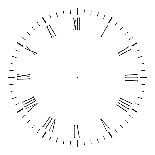
For our clock I have used single image (as face of our clock):
对于我们的时钟,我使用了单个图像(作为我们的时钟):
Finally we have built our clock! This was difficult, but we did it. I hope that this will interesting addition to your website. Don’t forget to tell thanks and leave a comment. Good luck!
终于,我们建立了时钟! 这很困难,但是我们做到了。 希望这会对您的网站有所帮助。 别忘了感谢并发表评论。 祝好运!
翻译自: https://www.script-tutorials.com/analog-clock-with-pure-css3/


 京公网安备 11010802041100号 | 京ICP备19059560号-4 | PHP1.CN 第一PHP社区 版权所有