public void onClick(View v) {
Toast.makeText(ButtonActivity.this,“btn_1点击事件MyOnClickListener”,Toast.LENGTH_SHORT).show();
}
}
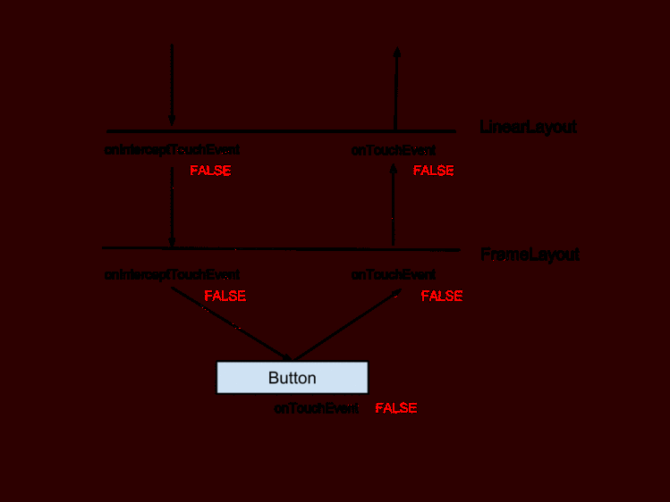
交互事件小结
Button显示字母大写
解决方案:设置属性android:textAllCaps="false"即可解决
Button设置backgroud无效
解决方案:默认的颜色设置来自于res/values/themes.xml。
将里面的主题parent="Theme.MaterialComponents.DayNight.DarkActionBar"改为(其他主题也可以)parent=“Theme.MaterialComponents.DayNight.DarkActionBar.Bridge”。
Button点击文字变色
方法一
定义一个drawable文件,代码如下:
方法二
1.首先你要在你的color文件下加入几个你需要的色值,注意不同的是不是一般的color标签,而是drawable标签,代码如下:
#ff0000
#000000
#FFFFFF
2.定义一个drawable文件,就和正常的selector文件差不多,唯一的区别就是把drawable字段变成color在里面引入你刚刚定义的颜色,代码如下:
android:color="@drawable/drawable_color_black" />
把drawable文件设置为textColor选项就可以了。
以上就是本文Button的全部内容,咱们下面看看他的子类。
RadioButton
===========
RadioButton 单选按钮,继承自 Button,所以拥有 Button 的所有公开属性和方法RadioButton 只有两个状态,选中与未选中,所以也就只有一个属性是最重要的,那就是 android:checked(设置或获取 RadioButton 的选中状态)。
实例
–
在布局文件中添加RadioButton
android:id="@+id/rb_red"
android:layout_width=“wrap_content”
android:layout_height=“wrap_content”
android:text=“红色”
android:textColor="@color/color_ff0000"
android:textSize="@dimen/text_size_18" />
在Activity中添加一个 OnCheckedChangeListener 事件处理器
rb_red.setOnCheckedChangeListener(new CompoundButton.OnCheckedChangeListener() {
@Override
public void onCheckedChanged(CompoundButton buttonView, boolean isChecked) {
//isChecked用于判断 RadioButton 是否选中
if(isChecked){
MLog.e(“选中”);
}else{
MLog.e(“未选中”);
}
}
});
「isChecked」 用于判断RadioButton是否选中。
咱们看运行效果
然后你会发现 只能选中不能取消,说好的单选按钮,怎么成了选择按钮,并且效果图上同时选择了两种颜色。这只能说明我们实现了单选按钮,而不能说我们实现了单选功能。
实现单选功能的方案
-
1.通过代码进行判断来取消其他按钮的选中状态。
-
2.引入RadioGroup
RadioGroup 单选按钮组
RadioGroup 用于将几个 RadioButton 组在一起形成单选按钮组,实现单选功能,也就是选中一个,会取消其它选项的选中。
RadioGroup 初始化时可以所有选项都未选中,但一旦选中了就没办法取消不选中某个了,除非手动调用 clearCheck() 方法。
如果想改变 RadioGroup 里 RadioButton 的排列方式,可以使用属性 android:orientation。
在布局文件中添加控件
新增1个RadioGroup和2个RadioButton,要为每个 RadioButton 添加一个 id,不然单选功能会生效
android:id="@+id/rg"
android:layout_width=“wrap_content”
android:layout_height=“wrap_content”
android:layout_gravity=“center_horizontal”
android:orientation=“horizontal”>
android:id="@+id/rb_liangpi"
android:layout_width=“wrap_content”
android:layout_height=“wrap_content”
android:text=“凉皮”
android:textSize="@dimen/text_size_18" />
android:id="@+id/rb_roujiamo"
android:layout_width=“wrap_content”
android:layout_height=“wrap_content”
android:text=“肉夹馍”
android:textSize="@dimen/text_size_18" />
在Activity中添加一个 OnCheckedChangeListener 事件处理器
这个OnCheckedChangeListener**「来自RadioGroup」**,而不是RadioButton的CompoundButton.OnCheckedChangeListener。
rg.setOnCheckedChangeListener(new RadioGroup.OnCheckedChangeListener() {
@Override
public void onCheckedChanged(RadioGroup group, int checkedId) {
if(checkedId==R.id.rb_liangpi){
MLog.e(“选择了凉皮”);
}else{
MLog.e(“选择了肉夹馍”);
}
}
});
咱们看运行效果
如此单选按钮功能就实现了,下面咱们看看他的兄弟CheckBox(复选框)。
CheckBox
========
CheckBox 复选框,除了从 Button 继承而来的属性外,没有自己的属性,但从 CompoundButton 继承了一个属性 android:checked 用于表示是否选中。
可以把多个 CheckBox 放在一起实现同时选中多项,但是,它们之间没有任何关系,一个的选中并不会影响另一个选中或者不选中。
实例
–
在布局文件中添加几个CheckBox
android:layout_width=“match_parent”
android:layout_height=“wrap_content”
android:orientation=“vertical”>
android:id="@+id/cb_yan"
android:layout_width=“wrap_content”
android:layout_height=“wrap_content”
android:checked=“true”
android:text=“加盐”
android:textSize="@dimen/text_size_18" />
android:id="@+id/cb_cu"
android:layout_width=“wrap_content”
android:layout_height=“wrap_content”
android:text=“加醋”
android:textSize="@dimen/text_size_18" />
android:id="@+id/cb_lajiao"
android:layout_width=“wrap_content”
android:layout_height=“wrap_content”
android:text=“加辣椒”
android:textSize="@dimen/text_size_18" />
在Activity中为每个CheckBox添加一个 OnCheckedChangeListener 事件处理器
cb_cu.setChecked(true);
cb_yan.setOnCheckedChangeListener(this);
cb_cu.setOnCheckedChangeListener(this);
cb_lajiao.setOnCheckedChangeListener(this);
@Override
public void onCheckedChanged(CompoundButton buttonView, boolean isChecked) {
switch (buttonView.getId()){
case R.id.cb_yan:
if(isChecked){
MLog.e(“选中加盐”);
}else{
MLog.e(“未选中加盐”);
}
break;
case R.id.cb_cu:
if(isChecked){
MLog.e(“选中加醋”);
}else{
MLog.e(“未选中加醋”);
}
break;
case R.id.cb_lajiao:
if(isChecked){
MLog.e(“选中加辣椒”);
}else{
MLog.e(“未选中加辣椒”);
}
break;
}
}
咱们看运行效果

然后你
会发现它们之间没有任何关系,一个的选中并不会影响另一个选中或者不选中。都是**「一个独立的个体」**。
如此CheckBox功能就实现了,下面咱们看看他的兄弟Switch(开关)。
Switch
======
-
Switch 继承自 Button 和 CompoundButton,所以拥有它们的属性、方法和事件;
-
Switch和ToggleButton一样,都允许我们在两个状态之间切换,有点类似于现在流行的滑动解锁;
-
Switch 有别于 ToggleButton 的地方,就是外观上会同时显示 「开」 和 「关」 的文本,有利于引导用户操作,比如 ToggleButton 在开的时候只会显示开的文本,但点一下会发生什么是未知的,但 Switch 就不一样了,很明切告诉你,你点了之后会发生什么。
Switch的XML属性

实例
–
在布局文件中添加Switch
android:id="@+id/switch_power"
android:layout_width=“wrap_content”
android:layout_height=“50dp”
android:textOn=“同意”
android:textOff=“不同意”
android:text=“权限”
android:showText=“true”
android:checked=“true”
android:textSize="@dimen/text_size_18" />
在Activity中为Switch添加 OnCheckedChangeListener 事件处理器
switch_power.setOnCheckedChangeListener(new CompoundButton.OnCheckedChangeListener() {
@Override
public void onCheckedChanged(CompoundButton buttonView, boolean isChecked) {
if(isChecked){
MLog.e(“已同意”);
}else{
MLog.e(“未同意”);
}
}
});
咱们看运行效果

如果你对原生的按钮不爽,那你就自定义 Switch 外观,我们可以属性 android:track 和 android:thumb 定制 Switch 的背景图片和滑块图片
不过要注意,每个图片都有两种状态,开 和 关,而且有个比较坑的地方,就是图片资源多大,Switch 就多大,如果需要改变,就要通过 Java 获得 Drawable 对象,然后对大小进行修改。
如此Switch功能就实现了,下面咱们看看他的兄弟ToggleButton(开关按钮)。
ToggleButton
============
ToggleButton (开关按钮) 允许我们在两个状态之间切换,有点类似于灯的开关。 ToggleButton 和 Switch 一样都继承自 CompoundButton ,所以都有 Button 的属性和方法,又有 CompoundButton 的属性 android:checked
实例
–
在布局文件中添加ToggleButton
android:id="@+id/tb_power"
android:text=“Power”
android:textOn=“开灯”
android:textOff=“关灯”
android:checked=“true”
android:layout_width=“wrap_content”
android:layout_height=“wrap_content” />
android:id="@+id/tb_power2"
android:text=“Power”
android:textOn=“开灯”
android:textOff=“关灯”
android:layout_width=“wrap_content”
就要通过 Java 获得 Drawable 对象,然后对大小进行修改。
如此Switch功能就实现了,下面咱们看看他的兄弟ToggleButton(开关按钮)。
ToggleButton
============
ToggleButton (开关按钮) 允许我们在两个状态之间切换,有点类似于灯的开关。 ToggleButton 和 Switch 一样都继承自 CompoundButton ,所以都有 Button 的属性和方法,又有 CompoundButton 的属性 android:checked
实例
–
在布局文件中添加ToggleButton
android:id="@+id/tb_power"
android:text=“Power”
android:textOn=“开灯”
android:textOff=“关灯”
android:checked=“true”
android:layout_width=“wrap_content”
android:layout_height=“wrap_content” />
android:id="@+id/tb_power2"
android:text=“Power”
android:textOn=“开灯”
android:textOff=“关灯”
android:layout_width=“wrap_content”


 京公网安备 11010802041100号