学过Python数据分析的朋友都知道,在可视化的工具中,有很多优秀的三方库,比如matplotlib,seaborn,plotly,Boken,pyecharts等等。这些可视化库都有自己的特点,在实际应用中也广为大家使用。
plotly、Boken等都是交互式的可视化工具,结合Jupyter notebook可以非常灵活方便地展现分析后的结果。虽然做出的效果非常的炫酷,比如plotly,但是每一次都需要写很长的代码,一是麻烦,二是不便于维护。
我觉得在数据的分析阶段,更多的时间应该放在分析上,维度选择、拆解合并,业务理解和判断。如果既可以减少代码量,又可以做出炫酷可视化效果,那将大大提高效率。当然如果有特别的需求除外,此方法仅针对想要快速可视化进行分析的人。
本篇给大家介绍一个非常棒的工具,cufflinks,可以完美解决这个问题,且效果一样炫酷。
cufflinks介绍
就像seaborn封装了matplotlib一样,cufflinks在plotly的基础上做了一进一步的包装,方法统一,参数配置简单。其次它还可以结合pandas的dataframe随意灵活地画图。可以把它形容为"pandas like visualization"。
毫不夸张地说,画出各种炫酷的可视化图形,我只需一行代码,效率非常高,同时也降低了使用的门槛儿。cufflinks的github链接如下:
https://github.com/santosjorge/cufflinks
安装
pip install cufflinks
cufflinks操作
cufflinks库一直在不断更新,目前最新版为V0.14.0,支持plotly3.0。首先我们看看它都支持哪些种类的图形,可以通过help来查看。
import cufflinks as cf
cf.help()
Use 'cufflinks.help(figure)' to see the list of available parameters for the given figure.
Use 'DataFrame.iplot(kind=figure)' to plot the respective figure
Figures:
	bar
	box
	bubble
	bubble3d
	candle
	choroplet
	distplot
	heatmap
	histogram
	ohlc
	pie
	ratio
	scatter
	scatter3d
	scattergeo
	spread
	surface
	violin

- DataFrame:代表pandas的数据框;
- Figure:代表我们上面看到的可绘制图形,比如bar、box、histogram等等;
- iplot:代表绘制方法,其中有很多参数可以进行配置,调节符合你自己风格的可视化图形;
cufflinks实例
注意:以下图例都是动态图,无法放置gif图,可以自己尝试一下
我们通过几个实例感受一下上面的使用方法。使用过plotly的朋友可能知道,如果使用online模式,那么生成的图形是有限制的。所以,我们这里先设置为offline模式,这样就避免了出现次数限制问题。
import pandas as pd
import cufflinks as cf
import numpy as np

cf.set_config_file(offline=True)
然后我们需要按照上面的使用格式来操作,首先我们需要有个DataFrame,如果手头没啥数据,那可以先生成个随机数。cufflinks有一个专门生成随机数的方法,叫做datagen,用于生成不同维度的随机数据,比如下面。
lines线图
1)cufflinks使用datagen生成随机数;
2)figure定义为lines形式,数据为(1,500);
3)然后再用ta_plot绘制这一组时间序列,参数设置SMA展现三个不同周期的时序分析。
cf.datagen.lines(1,500).ta_plot(study='sma',period=[13,21,55])

box箱型图
cf.datagen.box(20).iplot(kind='box',legend=False)
可以看到,x轴每个box都有对应的名称,这是因为cufflinks通过kind参数识别了box图形,自动为它生成的名字。如果我们只生成随机数,它是这样子的,默认生成100行的随机分布的数据,列数由自己选定。
cf.datagen.box(10)

|
ZZQ.IX |
KKT.HE |
WUI.GF |
KUD.YP |
LVO.BR |
RIQ.OH |
HCY.AX |
TSI.WB |
CZC.FE |
PGJ.UN |
| 0 |
2.650637 |
2.860086 |
0.648258 |
0.453637 |
0.031173 |
1.588635 |
0.665888 |
1.322199 |
0.613859 |
1.887332 |
| 1 |
1.772565 |
1.223209 |
1.321523 |
5.185581 |
4.585844 |
2.950900 |
0.652469 |
0.471112 |
5.729238 |
3.034579 |
| 2 |
3.707357 |
5.745729 |
5.766174 |
1.785150 |
8.335558 |
17.388996 |
2.854110 |
5.725720 |
9.582913 |
1.221468 |
| 3 |
9.298724 |
8.008446 |
2.574685 |
3.924959 |
5.656232 |
8.797833 |
18.606412 |
10.594716 |
1.207231 |
3.901563 |
| 4 |
5.261365 |
3.498773 |
4.593977 |
6.516262 |
3.852370 |
3.402193 |
2.813485 |
2.340898 |
7.611254 |
5.423463 |
| ... |
... |
... |
... |
... |
... |
... |
... |
... |
... |
... |
| 95 |
0.136329 |
2.676648 |
0.403378 |
1.018672 |
1.447996 |
1.106163 |
1.563319 |
6.315881 |
1.148427 |
0.348217 |
| 96 |
4.243743 |
0.026604 |
0.442303 |
2.650356 |
7.911090 |
1.048235 |
3.231528 |
0.850884 |
0.336564 |
0.301514 |
| 97 |
2.223366 |
3.581352 |
2.712159 |
1.141006 |
1.841442 |
4.167166 |
10.543993 |
5.589251 |
12.338148 |
4.013969 |
| 98 |
1.391020 |
0.002552 |
0.177377 |
1.865509 |
0.690297 |
0.682517 |
7.477029 |
0.261913 |
0.020654 |
0.822866 |
| 99 |
0.229824 |
1.756769 |
1.782207 |
3.621471 |
1.523997 |
4.392876 |
0.403206 |
6.899078 |
1.268289 |
7.484547 |
100 rows × 10 columns
histogram直方图
cf.datagen.histogram(3).iplot(kind='histogram')
和plotly一样,我们可以通过一些辅助的小工具框选或者lasso选择来区分和选定指定区域,只要一行代码。
当然了,除了随机数据,任何的其它dataframe数据框都可以,包括我们自己导入的数据。

histogram条形图
df=pd.DataFrame(np.random.rand(10, 4), columns=['a', 'b', 'c', 'd'])
df.iplot(kind='bar',barmode='stack')

上面我们生成了一个(10,4)的dataframe数据框,名称分别是a,b,c,d。那么cufflinks将会根据iplot中的kind种类自动识别并绘制图形。参数设置为堆叠模式。
scatter散点图
df = pd.DataFrame(np.random.rand(50, 4), columns=['a', 'b', 'c', 'd'])
df.iplot(kind='scatter',mode='markers',colors=['orange','teal','blue','yellow'],size=10)

bubble气泡图
df.iplot(kind='bubble',x='a',y='b',size='c')

scatter matrix 散点矩阵图
df = pd.DataFrame(np.random.randn(1000, 4), columns=['a', 'b', 'c', 'd'])
df.scatter_matrix()

subplots子图
df=cf.datagen.lines(4)
df.iplot(subplots=True,shape=(4,1),shared_xaxes=True,vertical_spacing=.02,fill=True)

df.iplot(subplots=True,subplot_titles=True,legend=False)

更复杂一些的
df=cf.datagen.bubble(10,50,mode='stocks')
figs=cf.figures(df,[dict(kind='histogram',keys='x',color='blue'),
                    dict(kind='scatter',mode='markers',x='x',y='y',size=5),
                    dict(kind='scatter',mode='markers',x='x',y='y',size=5,color='teal')],asList=True)
figs.append(cf.datagen.lines(1).figure(bestfit=True,colors=['blue'],bestfit_colors=['pink']))
base_layout=cf.tools.get_base_layout(figs)
sp=cf.subplots(figs,shape=(3,2),base_layout=base_layout,vertical_spacing=.15,horizontal_spacing=.03,
               specs=[[{'rowspan':2},{}],[None,{}],[{'colspan':2},None]],
               subplot_titles=['Histogram','Scatter 1','Scatter 2','Bestfit Line'])
sp['layout'].update(showlegend=False)
cf.iplot(sp)

shapes形状图
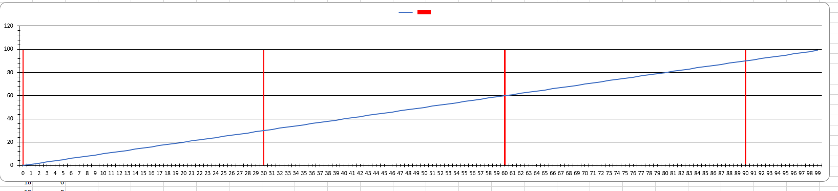
如果我们想在lines图上增加一些直线作为参考基准,这时候我们可以使用hlines的类型图。
df=cf.datagen.lines(3,columns=['a','b','c'])
df.iplot(hline=[dict(y=-1,color='blue',pink',dash='dash')])

或者是将某个区域标记出来,可以使用hspan类型。
df.iplot(hspan=[(-1,1),(2,5)])

又或者是竖条的区域,可以用vspan类型。
df.iplot(vspan={'x0':'2015-02-15','x1':'2015-03-15','color':'teal','fill':True,'opacity':.4})

如果对iplot中的参数不熟练,直接输入以下代码即可查询。
help(df.iplot)


 京公网安备 11010802041100号