前段时间,湖人当家球星 科比·布莱恩特不幸遇难。这对于无数的球迷来说无疑使晴天霹雳, 他逆天终究也没能改命,但命运也从来都没改得了他,曼巴精神会一直延续下去。 随着大数据时代的到来,好像任何事情都可以和大数据这三个字挂钩。早在很久以前,大数据分析就已经广泛的应用在运动员职业生涯规划、医疗、金融等方面,在本文中将会使用Python对球星科比进行对维度分析,向 “老大” 致敬!
那天,是2020年1月27日凌晨,我失眠了,足足在床上打滚到4点钟还是睡不着,解锁屏幕,盯着刺眼的手机打算刷刷微博,但却得到了一个令人震惊的消息:球星科比不幸遇难。 换做是往常,我当然是举报三连,这种标题党罪有应得,但却刷到了越来越多条类似的消息,直到看到官方发布的消息。
正如我的文案所说,我没有见过凌晨四点的洛杉矶,可我在凌晨四点听闻了你去世的消息,1978-2020。
作为球迷,我们能做的只有惋惜与缅怀。不散播谣言,不消费 “曼巴精神”
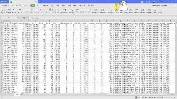
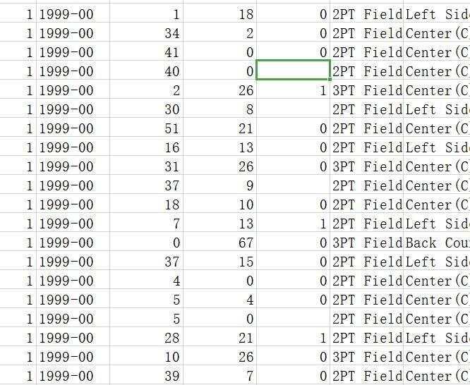
来源: NBA官方提供了的科比布莱恩特近二十年职业生涯数据资料集(数据量比较庞大,大约有3万行)
翻阅文档时不难发现其中有很多空缺值,简单粗暴的方式是直接删除有空值的行,但为了样本完整性与预测结果的正确率。
首先我们对投篮距离做一个简单的异常值检测,这里采用的是箱线图呈现
#-*- coding: utf-8 -*-
catering_sale = '2.csv'
data = pd.read_csv(catering_sale, index_col = 'shot_id') #读取数据,指定“shot_id”列为索引列
import matplotlib.pyplot as plt #导入图像库
plt.rcParams['font.sans-serif'] = ['SimHei'] #用来正常显示中文标签
plt.rcParams['axes.unicode_minus'] = False #用来正常显示负号
#
plt.figure() #建立图像
p = data.boxplot(return_type='dict') #画箱线图,直接使用DataFrame的方法
x = p['fliers'][0].get_xdata() # 'flies'即为异常值的标签
y = p['fliers'][0].get_ydata()
y.sort() #从小到大排序,该方法直接改变原对象
print('共有30687个数据,其中异常值的个数为{}'.format(len(y)))
#用annotate添加注释
#其中有些相近的点,注解会出现重叠,难以看清,需要一些技巧来控制。
for i in range(len(x)):
  if i>0:
    plt.annotate(y[i], xy = (x[i],y[i]), xytext=(x[i]+0.05 -0.8/(y[i]-y[i-1]),y[i]))
  else:
    plt.annotate(y[i], xy = (x[i],y[i]), xytext=(x[i]+0.08,y[i]))
plt.show() #展示箱线图
我们将得到这样的结果:
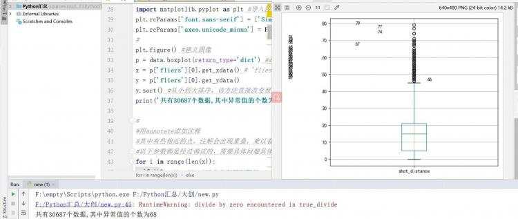
根据判断,该列数据有68个异常值,这里采取的操作是将这些异常值所在行删除,其他列属性同理。
将数据导入,并按我们的需求对数据进行合并、添加新列名的操作
import pandas as pd
allData = pd.read_csv('data.csv')
data = allData[allData['shot_made_flag'].notnull()].reset_index()
# 添加新的列名
data['game_date_DT'] = pd.to_datetime(data['game_date'])
data['dayOfWeek'] = data['game_date_DT'].dt.dayofweek
data['dayOfYear'] = data['game_date_DT'].dt.dayofyear
data['secondsFromPeriodEnd'] = 60 * data['minutes_remaining'] + data['seconds_remaining']
data['secondsFromPeriodStart'] = 60 * (11 - data['minutes_remaining']) + (60 - data['seconds_remaining'])
data['secondsFromGameStart'] = (data['period'] <= 4).astype(int) * (data['period'] - 1) * 12 * 60 + (
        data['period'] > 4).astype(int) * ((data['period'] - 4) * 5 * 60 + 3 * 12 * 60) + data['secondsFromPeriodStart']
'''
其中:
secondsFromPeriodEnd 一个周期结束后的秒
secondsFromPeriodStart 一个周期开始时的秒
secondsFromGameStart 一场比赛开始后的秒数
'''
#对数据进行验证
print(data.loc[:10, ['period', 'minutes_remaining', 'seconds_remaining', 'secondsFromGameStart']])
运行有如下结果:
看起来还是一切正常的
    period  minutes_remaining  seconds_remaining  secondsFromGameStart
0        1                 10                 22                    98
1        1                  7                 45                   255
2        1                  6                 52                   308
3        2                  6                 19                  1061
4        3                  9                 32                  1588
5        3                  8                 52                  1628
6        3                  6                 12                  1788
7        3                  3                 36                  1944
8        3                  1                 56                  2044
9        1                 11                  0                    60
10       1                  7                  9                   291
Process finished with exit code 0
根据不同的时间变化(从比赛开始)来绘制投篮的尝试图
这里我们将用到matplotlib包
import pandas as pd
import numpy as np
import matplotlib.pyplot as plt
plt.rcParams['figure.figsize'] = (16, 16)
plt.rcParams['font.size'] = 16
binsSizes = [24, 12, 6]
plt.figure()
for k, binSizeInSeconds in enumerate(binsSizes):
    timeBins = np.arange(0, 60 * (4 * 12 + 3 * 5), binSizeInSeconds) + 0.01
    attemptsAsFunctionOfTime, b = np.histogram(data['secondsFromGameStart'], bins=timeBins)
    maxHeight = max(attemptsAsFunctionOfTime) + 30
    barWidth = 0.999 * (timeBins[1] - timeBins[0])
    plt.subplot(len(binsSizes), 1, k + 1)
    plt.bar(timeBins[:-1], attemptsAsFunctionOfTime, align='edge',  second time bins')
    plt.vlines(x=[0, 12 * 60, 2 * 12 * 60, 3 * 12 * 60, 4 * 12 * 60, 4 * 12 * 60 + 5 * 60, 4 * 12 * 60 + 2 * 5 * 60,  4 * 12 * 60 + 3 * 5 * 60], ymin=0, ymax=maxHeight, colors='r')
    plt.xlim((-20, 3200))
    plt.ylim((0, maxHeight))
    plt.ylabel('attempts')
plt.xlabel('time [seconds from start of game]')
plt.show()
看下效果:
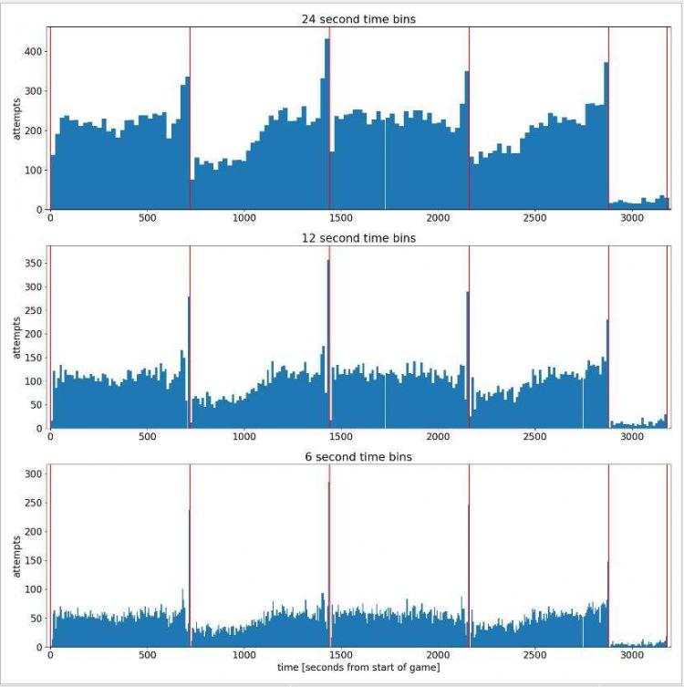
可以看出随着比赛时间的进行,科比的出手次数呈现增长状态。
这里们将做一个对比来判断一下科比的命中率如何
# 在比赛中,根据时间的函数绘制出投篮精度。
# 绘制精度随时间变化的函数
plt.rcParams['figure.figsize'] = (15, 10)
plt.rcParams['font.size'] = 16
binSizeInSecOnds= 20
timeBins = np.arange(0, 60 * (4 * 12 + 3 * 5), binSizeInSeconds) + 0.01
attemptsAsFunctionOfTime, b = np.histogram(data['secondsFromGameStart'], bins=timeBins)
madeAttemptsAsFunctionOfTime, b = np.histogram(data.loc[data['shot_made_flag'] == 1, 'secondsFromGameStart'],                               bins=timeBins)
attemptsAsFunctionOfTime[attemptsAsFunctionOfTime <1] = 1
accuracyAsFunctiOnOfTime= madeAttemptsAsFunctionOfTime.astype(float) / attemptsAsFunctionOfTime
accuracyAsFunctionOfTime[attemptsAsFunctionOfTime <= 50] = 0  # zero accuracy in bins that don't have enough samples
maxHeight = max(attemptsAsFunctionOfTime) + 30
barWidth = 0.999 * (timeBins[1] - timeBins[0])
plt.figure()
plt.subplot(2, 1, 1)
plt.bar(timeBins[:-1], attemptsAsFunctionOfTime, align='edge', attempts')
plt.title(str(binSizeInSeconds) + ' second time bins')
plt.vlines(x=[0, 12 * 60, 2 * 12 * 60, 3 * 12 * 60, 4 * 12 * 60, 4 * 12 * 60 + 5 * 60, 4 * 12 * 60 + 2 * 5 * 60,
              4 * 12 * 60 + 3 * 5 * 60], ymin=0, ymax=maxHeight, colors='r')
plt.subplot(2, 1, 2)
plt.bar(timeBins[:-1], accuracyAsFunctionOfTime, align='edge', accuracy')
plt.xlabel('time [seconds from start of game]')
plt.vlines(x=[0, 12 * 60, 2 * 12 * 60, 3 * 12 * 60, 4 * 12 * 60, 4 * 12 * 60 + 5 * 60, 4 * 12 * 60 + 2 * 5 * 60,
              4 * 12 * 60 + 3 * 5 * 60], ymin=0.0, ymax=0.7, colors='r')
plt.show()
看一下效果怎么样
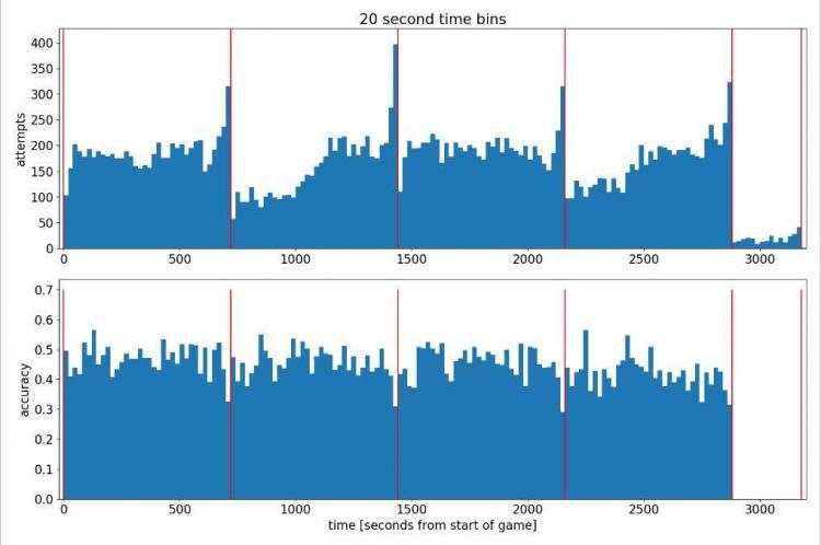
分析可得出科比的投篮命中率大概徘徊在0.4左右,但这并不是我们想要的效果
为了进一步对数据进行挖掘,我们需要使用一些算法了。
那么 什么是GMM聚类呢?
GMM是高斯混合模型(或者是混合高斯模型)的简称。大致的意思就是所有的分布可以看做是多个高斯分布综合起来的结果。这样一来,任何分布都可以分成多个高斯分布来表示。
因为我们知道,按照大自然中很多现象是遵从高斯(即正态)分布的,但是,实际上,影响一个分布的原因是多个的,甚至有些是人为的,可能每一个影响因素决定了一个高斯分布,多种影响结合起来就是多个高斯分布。(个人理解)
因此,混合高斯模型聚类的原理:通过样本找到K个高斯分布的期望和方差,那么K个高斯模型就确定了。在聚类的过程中,不会明确的指定一个样本属于哪一类,而是计算这个样本在某个分布中的可能性。
高斯分布一般还要结合EM算法作为其似然估计算法。
想深入了解聚类算法的各位请移步:常见的三种聚类算法.
'''
现在,让我们继续我们的初步探索,研究一下科比投篮的空间位置。
我们将通过构建一个高斯混合模型来实现这一点,该模型试图对科比的射门位置进行简单的总结。
用GMM在科比的投篮位置上对他们的投篮尝试进行聚类
'''
numGaussians = 13
gaussianMixtureModel = mixture.GaussianMixture(n_compOnents=numGaussians, covariance_type='full',                               init_params='kmeans', n_init=50,                               verbose=0, random_state=5)
gaussianMixtureModel.fit(data.loc[:, ['loc_x', 'loc_y']])
# 将GMM集群作为字段添加到数据集中
data['shotLocationCluster'] = gaussianMixtureModel.predict(data.loc[:, ['loc_x', 'loc_y']])
这里借鉴了MichaelKrueger的excelent脚本里的draw_court()函数
draw_court()函数
def draw_court(ax=None, color='black', lw=2, outer_lines=False):
    # 如果没有提供用于绘图的axis对象,就获取当前对象
    if ax is None:
        ax = plt.gca()
    # 创建一个NBA的球场
    # 建一个篮筐
    # 直径是18,半径是9
    # 7.5在坐标系内
    hoop = Circle((0, 0), radius=7.5, line9"
    # 调整一下thetal的值,直到它们与三分线对齐
    three_arc = Arc((0, 0), 475, 475, theta1=22, theta2=158, lineprism language-python">def Draw2DGaussians(gaussianMixtureModel, ellipseColors, ellipseTextMessages):
    fig, h = plt.subplots()
    for i, (mean, covarianceMatrix) in enumerate(zip(gaussianMixtureModel.means_, gaussianMixtureModel.covariances_)):
        # 得到协方差矩阵的特征向量和特征值
        v, w = np.linalg.eigh(covarianceMatrix)
        v = 2.5 * np.sqrt(v)  # go to units of standard deviation instead of variance 用标准差的单位代替方差
        # 计算椭圆角和两轴长度并画出它
        u = w[0] / np.linalg.norm(w[0])
        angle = np.arctan(u[1] / u[0])
        angle = 180 * angle / np.pi  # convert to degrees 转换成度数
        currEllipse = mpl.patches.Ellipse(mean, v[0], v[1], 180 + angle, color=ellipseColors[i])
        currEllipse.set_alpha(0.5)
        h.add_artist(currEllipse)
        h.text(mean[0] + 7, mean[1] - 1, ellipseTextMessages[i], fOntsize=13, color='blue')
下面开始绘制2D高斯投篮次数图,图中的每个椭圆都是离高斯分布中心2.5个标准差远的计数,每个蓝色的数字代表从该高斯分布观察到的所占百分比
# 显示投篮尝试的高斯混合椭圆
plt.rcParams['figure.figsize'] = (13, 10)
plt.rcParams['font.size'] = 15
ellipseTextMessages = [str(100 * gaussianMixtureModel.weights_[x])[:4] + '%' for x in range(numGaussians)]
ellipseColors = ['red', 'green', 'purple', 'cyan', 'magenta', 'yellow', 'blue', 'orange', 'silver', 'maroon', 'lime', 'olive', 'brown', 'darkblue']
Draw2DGaussians(gaussianMixtureModel, ellipseColors, ellipseTextMessages)
draw_court(outer_lines=True)
plt.ylim(-60, 440)
plt.xlim(270, -270)
plt.title('shot attempts')
plt.show()
看一下成果:
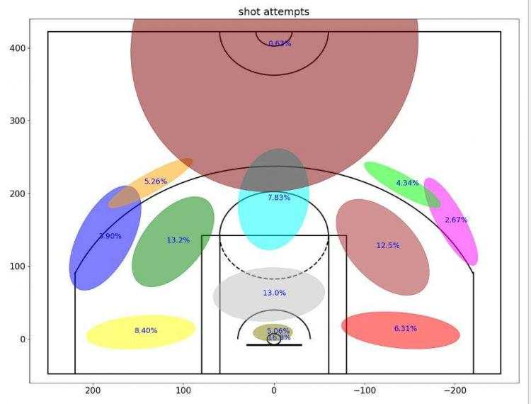
? 我们可以看到,着色后的2D高斯图中,科比在球场的左侧(或者从他看来是右侧)做了更多的投篮尝试。这可能是因为他是右撇子。此外,我们还可以看到,大量的投篮尝试(16.8%)是直接从篮下进行的,5.06%的额外投篮尝试是从非常接近篮下的位置投出去的。
它看起来并不完美,但确实显示了一些有用的东西
对于绘制的每个高斯集群的投篮精度,蓝色数字将代表从这个集群中获取到的准确性,因此我们可以了解哪些是容易的,哪些是困难的。
对于每个集群,计算一下它的精度并绘图
plt.rcParams['figure.figsize'] = (13, 10)
plt.rcParams['font.size'] = 15
variableCategories = data['shotLocationCluster'].value_counts().index.tolist()
clusterAccuracy = {}
for category in variableCategories:
    shotsAttempted = np.array(data['shotLocationCluster'] == category).sum()
    shotsMade = np.array(data.loc[data['shotLocationCluster'] == category, 'shot_made_flag'] == 1).sum()
    clusterAccuracy[category] = float(shotsMade) / shotsAttempted
ellipseTextMessages = [str(100 * clusterAccuracy[x])[:4] + '%' for x in range(numGaussians)]
Draw2DGaussians(gaussianMixtureModel, ellipseColors, ellipseTextMessages)
draw_court(outer_lines=True)
plt.ylim(-60, 440)
plt.xlim(270, -270)
plt.title('shot accuracy')
plt.show()
看一下效果图
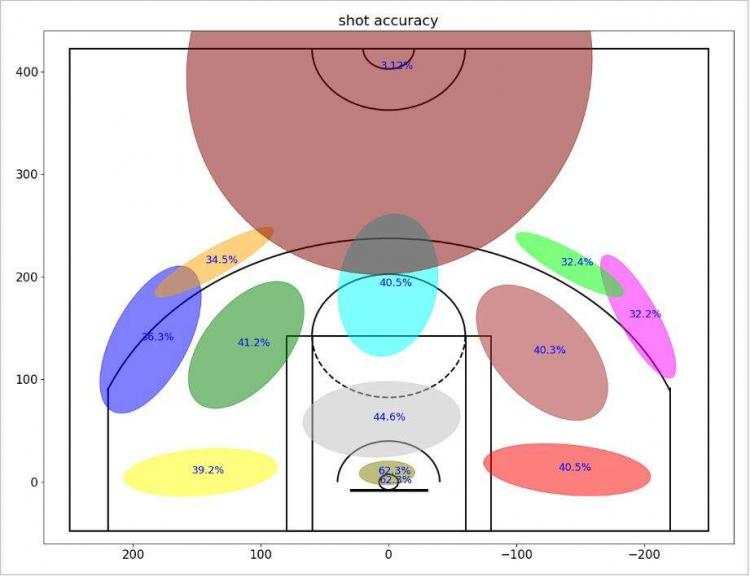
我们可以清楚地看到投篮距离和精度之间的关系。
另一个有趣的事实是:科比不仅在右侧做了更多的投篮尝试(从他看来的那边),而且他在这些投篮尝试上更擅长
? 现在让我们绘制一个科比职业生涯的二维时空图。在X轴上,将从比赛开始时计时;在y轴上有科比投篮的集群指数(根据集群精度排序);图片的深度将反映科比在那个特定的时间从那个特定的集群中尝试的次数;图中的红色垂线分割比赛的每节
# 制科比整个职业生涯比赛中的二维时空直方图
plt.rcParams['figure.figsize'] = (18, 10) #设置图像显示的大小
plt.rcParams['font.size'] = 18 #字体大小
# 根据集群的准确性对它们进行排序
sortedClustersByAccuracyTuple = sorted(clusterAccuracy.items(), key=operator.itemgetter(1), reverse=True)
sortedClustersByAccuracy = [x[0] for x in sortedClustersByAccuracyTuple]
binSizeInSecOnds= 12
timeInUnitsOfBins = ((data['secondsFromGameStart'] + 0.0001) / binSizeInSeconds).astype(int)
locatiOnInUintsOfClusters= np.array(
    [sortedClustersByAccuracy.index(data.loc[x, 'shotLocationCluster']) for x in range(data.shape[0])])
# 建立科比比赛的时空直方图
shotAttempts = np.zeros((gaussianMixtureModel.n_components, 1 + max(timeInUnitsOfBins)))
for shot in range(data.shape[0]):
    shotAttempts[locationInUintsOfClusters[shot], timeInUnitsOfBins[shot]] += 1
# 让y轴有更大的面积,这样会更明显
shotAttempts = np.kron(shotAttempts, np.ones((5, 1)))
# 每节结束的位置
vlinesList = 0.5001 + np.array([0, 12 * 60, 2 * 12 * 60, 3 * 12 * 60, 4 * 12 * 60, 4 * 12 * 60 + 5 * 60]).astype(
    int) / binSizeInSeconds
plt.figure(figsize=(13, 8)) #设置宽和高
plt.imshow(shotAttempts, cmap='copper', interpolation="nearest")  #设置了边界的模糊度,或者是图片的模糊度
plt.xlim(0, float(4 * 12 * 60 + 6 * 60) / binSizeInSeconds)
plt.vlines(x=vlinesList, ymin=-0.5, ymax=shotAttempts.shape[0] - 0.5, colors='r')
plt.xlabel('time from start of game [sec]')
plt.ylabel('cluster (sorted by accuracy)')
plt.show()
看一下运行结果:
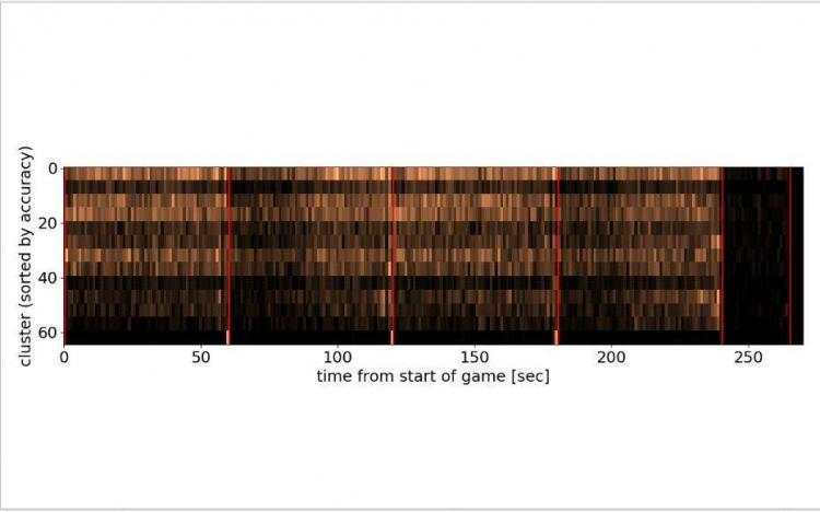
? 集群按精度降序排序。高准确度的投篮在最上面,而低准确度的半场投篮在最下面,我们现在可以看到,在第一、第二和第三节中的“最后一秒出手”实际上是从很远的地方“绝杀”, 然而,有趣的是,在第4节中,最后一秒的投篮并不属于“绝杀”的投篮群,而是属于常规的3分投篮(这仍然比较难命中,但不是毫无希望的)。
在以后的分析中,我们将根据投篮属性来评估投篮难度(如投篮类型和投篮距离)
下面将为投篮难度模型创建一个新表格
def FactorizeCategoricalVariable(inputDB, categoricalVarName):
    oppOnentCategories= inputDB[categoricalVarName].value_counts().index.tolist()
    outputDB = pd.DataFrame()
    for category in opponentCategories:
        featureName = categoricalVarName + ': ' + str(category)
        outputDB[featureName] = (inputDB[categoricalVarName] == category).astype(int)
    return outputDB
featuresDB = pd.DataFrame()
featuresDB['homeGame'] = data['matchup'].apply(lambda x: 1 if (x.find('@') <0) else 0)
featuresDB = pd.concat([featuresDB, FactorizeCategoricalVariable(data, 'opponent')], axis=1)
featuresDB = pd.concat([featuresDB, FactorizeCategoricalVariable(data, 'action_type')], axis=1)
featuresDB = pd.concat([featuresDB, FactorizeCategoricalVariable(data, 'shot_type')], axis=1)
featuresDB = pd.concat([featuresDB, FactorizeCategoricalVariable(data, 'combined_shot_type')], axis=1)
featuresDB = pd.concat([featuresDB, FactorizeCategoricalVariable(data, 'shot_zone_basic')], axis=1)
featuresDB = pd.concat([featuresDB, FactorizeCategoricalVariable(data, 'shot_zone_area')], axis=1)
featuresDB = pd.concat([featuresDB, FactorizeCategoricalVariable(data, 'shot_zone_range')], axis=1)
featuresDB = pd.concat([featuresDB, FactorizeCategoricalVariable(data, 'shotLocationCluster')], axis=1)
featuresDB['playoffGame'] = data['playoffs']
featuresDB['locX'] = data['loc_x']
featuresDB['locY'] = data['loc_y']
featuresDB['distanceFromBasket'] = data['shot_distance']
featuresDB['secondsFromPeriodEnd'] = data['secondsFromPeriodEnd']
featuresDB['dayOfWeek_cycX'] = np.sin(2 * np.pi * (data['dayOfWeek'] / 7))
featuresDB['dayOfWeek_cycY'] = np.cos(2 * np.pi * (data['dayOfWeek'] / 7))
featuresDB['timeOfYear_cycX'] = np.sin(2 * np.pi * (data['dayOfYear'] / 365))
featuresDB['timeOfYear_cycY'] = np.cos(2 * np.pi * (data['dayOfYear'] / 365))
labelsDB = data['shot_made_flag']
根据FeaturesDB表构建模型,并确保它不会过度匹配(即训练误差与测试误差相同)
使用一个额外的分类器
建立一个简单的模型,并确保它不超载
randomSeed = 1
numFolds = 4
stratifiedCV = model_selection.StratifiedKFold(n_splits=numFolds, shuffle=True, random_state=randomSeed)
mainLearner = ensemble.ExtraTreesClassifier(n_estimators=500, max_depth=5,                            min_samples_leaf=120, max_features=120,                            criterion='entropy', bootstrap=False,                            n_jobs=-1, random_state=randomSeed)
startTime = time.time()
trainAccuracy = []
validAccuracy = []
trainLogLosses = []
validLogLosses = []
for trainInds, validInds in stratifiedCV.split(featuresDB, labelsDB):
    # 分割训练和有效的集合
    X_train_CV = featuresDB.iloc[trainInds, :]
    y_train_CV = labelsDB.iloc[trainInds]
    X_valid_CV = featuresDB.iloc[validInds, :]
    y_valid_CV = labelsDB.iloc[validInds]
    # 训练
    mainLearner.fit(X_train_CV, y_train_CV)
    # 作出预测
    y_train_hat_mainLearner = mainLearner.predict_proba(X_train_CV)[:, 1]
    y_valid_hat_mainLearner = mainLearner.predict_proba(X_valid_CV)[:, 1]
    # 储存结果
    trainAccuracy.append(accuracy(y_train_CV, y_train_hat_mainLearner > 0.5))
    validAccuracy.append(accuracy(y_valid_CV, y_valid_hat_mainLearner > 0.5))
    trainLogLosses.append(log_loss(y_train_CV, y_train_hat_mainLearner))
    validLogLosses.append(log_loss(y_valid_CV, y_valid_hat_mainLearner))
print("-----------------------------------------------------")
print("total (train,valid) Accuracy = (%.5f,%.5f). took %.2f minutes" % (
    np.mean(trainAccuracy), np.mean(validAccuracy), (time.time() - startTime) / 60))
print("total (train,valid) Log Loss = (%.5f,%.5f). took %.2f minutes" % (
    np.mean(trainLogLosses), np.mean(validLogLosses), (time.time() - startTime) / 60))
print("-----------------------------------------------------")
mainLearner.fit(featuresDB, labelsDB)
data['shotDifficulty'] = mainLearner.predict_proba(featuresDB)[:, 1]
# 为了深入了解,我们来看看特性选择
featureInds = mainLearner.feature_importances_.argsort()[::-1]
featureImportance = pd.DataFrame(
    np.concatenate((featuresDB.columns[featureInds, None], mainLearner.feature_importances_[featureInds, None]),   axis=1),
    columns=['featureName', 'importanceET'])
print(featureImportance.iloc[:30, :])**看看运行结果如何**:
total (train,valid) Accuracy = (0.67912,0.67860). took 0.29 minutes
total (train,valid) Log Loss = (0.60812,0.61100). took 0.29 minutes
-----------------------------------------------------         featureName importanceET
0             action_type: Jump Shot     0.578036
1            action_type: Layup Shot     0.173274
2           combined_shot_type: Dunk     0.113341
3                           homeGame    0.0288043
4             action_type: Dunk Shot    0.0161591
5             shotLocationCluster: 9    0.0136386
6          combined_shot_type: Layup   0.00949568
7                 distanceFromBasket    0.0084703
8         shot_zone_range: 16-24 ft.    0.0072107
9        action_type: Slam Dunk Shot   0.00690316
10     combined_shot_type: Jump Shot   0.00592586
11              secondsFromPeriodEnd   0.00589391
12    action_type: Running Jump Shot   0.00544904
13           shotLocationCluster: 11   0.00449125
14                              locY   0.00388509
15   action_type: Driving Layup Shot   0.00364757
16  shot_zone_range: Less Than 8 ft.   0.00349615
17      combined_shot_type: Tip Shot   0.00260399
18         shot_zone_area: Center(C)    0.0011585
19                     opponent: DEN  0.000882106
20    action_type: Driving Dunk Shot  0.000848156
21  shot_zone_basic: Restricted Area  0.000650022
22            shotLocationCluster: 2  0.000513476
23             action_type: Tip Shot  0.000489918
24        shot_zone_basic: Mid-Range  0.000487306
25     action_type: Pullup Jump shot  0.000453641
26         shot_zone_range: 8-16 ft.  0.000452574
27                   timeOfYear_cycX  0.000432267
28                    dayOfWeek_cycX   0.00039668
29            shotLocationCluster: 8  0.000254077
Process finished with exit code 0
在这里想谈谈科比&#183;布莱恩特在决策过程中的一些问题;为此,我们将收集两组不同的效果图,并分析它们之间的差异:
考虑到科比投进或投失了最后一球,我收集了一些数据
timeBetweenShotsDict = {}
timeBetweenShotsDict['madeLast'] = []
timeBetweenShotsDict['missedLast'] = []
changeInDistFromBasketDict = {}
changeInDistFromBasketDict['madeLast'] = []
changeInDistFromBasketDict['missedLast'] = []
changeInShotDifficultyDict = {}
changeInShotDifficultyDict['madeLast'] = []
changeInShotDifficultyDict['missedLast'] = []
afterMadeShotsList = []
afterMissedShotsList = []
for shot in range(1, data.shape[0]):
    # 确保当前的投篮和最后的投篮都在同一场比赛的同一时间段
    sameGame = data.loc[shot, 'game_date'] == data.loc[shot - 1, 'game_date']
    samePeriod = data.loc[shot, 'period'] == data.loc[shot - 1, 'period']
    if samePeriod and sameGame:
        madeLastShot = data.loc[shot - 1, 'shot_made_flag'] == 1
        missedLastShot = data.loc[shot - 1, 'shot_made_flag'] == 0
        timeDifferenceFromLastShot = data.loc[shot, 'secondsFromGameStart'] - data.loc[shot - 1, 'secondsFromGameStart']
        distDifferenceFromLastShot = data.loc[shot, 'shot_distance'] - data.loc[shot - 1, 'shot_distance']
        shotDifficultyDifferenceFromLastShot = data.loc[shot, 'shotDifficulty'] - data.loc[shot - 1, 'shotDifficulty']
        # check for currupt data points (assuming all samples should have been chronologically ordered)
        # 检查数据(假设所有样本都按时间顺序排列)
        if timeDifferenceFromLastShot <0:
            continue
        if madeLastShot:
            timeBetweenShotsDict['madeLast'].append(timeDifferenceFromLastShot)
            changeInDistFromBasketDict['madeLast'].append(distDifferenceFromLastShot)
            changeInShotDifficultyDict['madeLast'].append(shotDifficultyDifferenceFromLastShot)
            afterMadeShotsList.append(shot)
        if missedLastShot:
            timeBetweenShotsDict['missedLast'].append(timeDifferenceFromLastShot)
            changeInDistFromBasketDict['missedLast'].append(distDifferenceFromLastShot)
            changeInShotDifficultyDict['missedLast'].append(shotDifficultyDifferenceFromLastShot)
            afterMissedShotsList.append(shot)
afterMissedData = data.iloc[afterMissedShotsList, :]
afterMadeData = data.iloc[afterMadeShotsList, :]
shotChancesListAfterMade = afterMadeData['shotDifficulty'].tolist()
totalAttemptsAfterMade = afterMadeData.shape[0]
totalMadeAfterMade = np.array(afterMadeData['shot_made_flag'] == 1).sum()
shotChancesListAfterMissed = afterMissedData['shotDifficulty'].tolist()
totalAttemptsAfterMissed = afterMissedData.shape[0]
totalMadeAfterMissed = np.array(afterMissedData['shot_made_flag'] == 1).sum()
为他们绘制“上次投篮后的时间”的柱状图
plt.rcParams['figure.figsize'] = (13, 10)
jointHist, timeBins = np.histogram(timeBetweenShotsDict['madeLast'] + timeBetweenShotsDict['missedLast'], bins=200)
barWidth = 0.999 * (timeBins[1] - timeBins[0])
timeDiffHist_GivenMadeLastShot, b = np.histogram(timeBetweenShotsDict['madeLast'], bins=timeBins)
timeDiffHist_GivenMissedLastShot, b = np.histogram(timeBetweenShotsDict['missedLast'], bins=timeBins)
maxHeight = max(max(timeDiffHist_GivenMadeLastShot), max(timeDiffHist_GivenMissedLastShot)) + 30
plt.figure()
plt.subplot(2, 1, 1)
plt.bar(timeBins[:-1], timeDiffHist_GivenMadeLastShot, made last shot')
plt.ylabel('counts')
plt.subplot(2, 1, 2)
plt.bar(timeBins[:-1], timeDiffHist_GivenMissedLastShot, missed last shot')
plt.xlabel('time since last shot')
plt.ylabel('counts')
plt.show()
看一下运行结果:
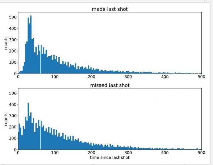
从图中可以看出:科比投了一个球之后有些着急去投下一个,而图中的一些比较平缓的值可能是球权在另一只队伍手中,需要一些时间来夺回。
为了更好地可视化柱状图之间的差异,我们来看看累积柱状图。
plt.rcParams['figure.figsize'] = (13, 6)
timeDiffCumHist_GivenMadeLastShot = np.cumsum(timeDiffHist_GivenMadeLastShot).astype(float)
timeDiffCumHist_GivenMadeLastShot = timeDiffCumHist_GivenMadeLastShot / max(timeDiffCumHist_GivenMadeLastShot)
timeDiffCumHist_GivenMissedLastShot = np.cumsum(timeDiffHist_GivenMissedLastShot).astype(float)
timeDiffCumHist_GivenMissedLastShot = timeDiffCumHist_GivenMissedLastShot / max(timeDiffCumHist_GivenMissedLastShot)
maxHeight = max(timeDiffCumHist_GivenMadeLastShot[-1], timeDiffCumHist_GivenMissedLastShot[-1])
plt.figure()
madePrev = plt.plot(timeBins[:-1], timeDiffCumHist_GivenMadeLastShot, label='made Prev')
plt.xlim((0, 500))
missedPrev = plt.plot(timeBins[:-1], timeDiffCumHist_GivenMissedLastShot, label='missed Prev')
plt.xlim((0, 500))
plt.ylim((0, 1))
plt.title('cumulative density function - CDF')
plt.xlabel('time since last shot')
plt.legend(loc='lower right')
plt.show()
运行效果如下:
虽然可以观察到密度有差异 ,但好像不太清楚,所以还是转换成高斯格式来显示数据吧
# 显示投中后和失球后的投篮次数
plt.rcParams['figure.figsize'] = (13, 10)
variableCategories = afterMadeData['shotLocationCluster'].value_counts().index.tolist()
clusterFrequency = {}
for category in variableCategories:
    shotsAttempted = np.array(afterMadeData['shotLocationCluster'] == category).sum()
    clusterFrequency[category] = float(shotsAttempted) / afterMadeData.shape[0]
ellipseTextMessages = [str(100 * clusterFrequency[x])[:4] + '%' for x in range(numGaussians)]
Draw2DGaussians(gaussianMixtureModel, ellipseColors, ellipseTextMessages)
draw_court(outer_lines=True)
plt.ylim(-60, 440)
plt.xlim(270, -270)
plt.title('after made shots')
variableCategories = afterMissedData['shotLocationCluster'].value_counts().index.tolist()
clusterFrequency = {}
for category in variableCategories:
    shotsAttempted = np.array(afterMissedData['shotLocationCluster'] == category).sum()
    clusterFrequency[category] = float(shotsAttempted) / afterMissedData.shape[0]
ellipseTextMessages = [str(100 * clusterFrequency[x])[:4] + '%' for x in range(numGaussians)]
Draw2DGaussians(gaussianMixtureModel, ellipseColors, ellipseTextMessages)
draw_court(outer_lines=True)
plt.ylim(-60, 440)
plt.xlim(270, -270)
plt.title('after missed shots')
plt.show()
让我们来看看最终结果:
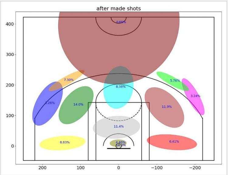
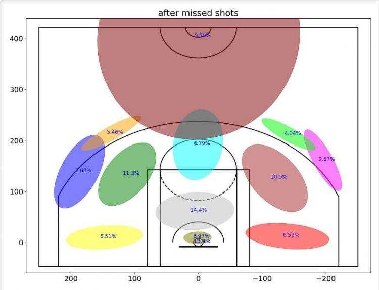
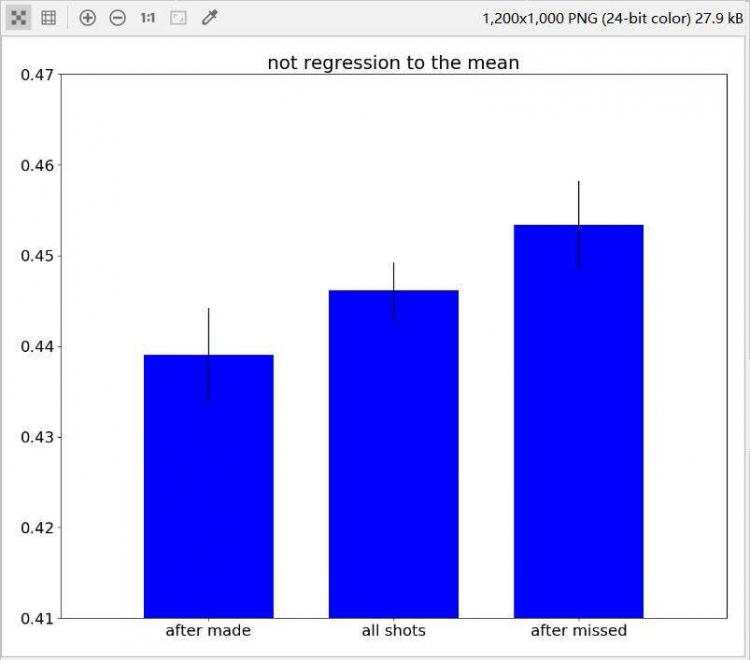
?现在很明显,在投丢一个球后,科比更可能直接从篮下投出下一球。在图中也可以看出,科比在投蓝进球后,下一球更有可能尝试投个三分球,但本次案例中并没有有效的数据可以证明科比有热手效应。不难看出,科比还是一个注重篮下以及罚球线周边功夫的球员,而且是一个十分自信的领袖,不愧为我们的老大!
本次获取到的数据集十分庞大,里面的内容也很充足,甚至包括了每一种投篮姿势、上篮姿势的详细数据,对于本数据中还未挖掘到的信息各位读者如果有兴趣可以自行尝试,相信一定会收获满满!
注: 可能本次分析中存在一些问题,还请各位读者指正,感谢阅读。


 京公网安备 11010802041100号 | 京ICP备19059560号-4 | PHP1.CN 第一PHP社区 版权所有