7
This is normal behaviour on iOS (and iOS only). You can work around it by declaring overflow: hidden on both html and body element. In addition, you should set the body to position: relative.
这是iOS(仅限iOS)上的正常行为。您可以通过声明溢出来解决它:隐藏在html和body元素上。此外,您应该将主体设置为position:relative。
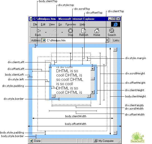
Overflow behaviour
There are several things at play here. To understand why the fix works, we first need to have a look at how the overflow of the viewport is set.
这里有几件事情在玩。要了解修复工作的原因,我们首先需要了解视口的溢出是如何设置的。
- The overflow of the viewport is determined by the overflow setting of the
html element.
- 视口的溢出由html元素的溢出设置决定。
- But as long as you leave the overflow of the
html element at its default (visible), the overflow setting of the body gets applied to the viewport, too. Ie, you can set either html or body to overflow: hidden when you target the viewport. The overflow behaviour of the body element itself is unaffected - so far.
- 但只要您将html元素的溢出保留为默认值(可见),主体的溢出设置也会应用于视口。即,您可以将html或body设置为overflow:当您定位视口时隐藏。到目前为止,身体元素本身的溢出行为不受影响。
- Now, if you set the overflow of the
htmlelement to anything other than visible, the transfer from body to viewport does no longer happen. In your particular case, if you set both overflows to hidden, the setting of the html element gets applied to the viewport, and the body element hides its overflow as well.
- 现在,如果将htmlelement的溢出设置为除可见之外的任何其他内容,则不会再发生从body到viewport的转移。在您的特定情况下,如果将两个溢出都设置为隐藏,则html元素的设置将应用于视口,并且body元素也会隐藏其溢出。
That's actually the case in every reasonably modern browser out there, and not specific to iOS.
实际情况就是每个合理的现代浏览器,而不是iOS特有的。
iOS quirks
Now, iOS ignores overflow: hidden on the viewport. The browser reserves the right to show the content as a whole, no matter what you declare in the CSS. This is intentional and not a bug, and continues to be the case in iOS 7 and 8. There is nothing anyone can do about it, either - it can't be turned off.
现在,iOS忽略了溢出:隐藏在视口上。无论您在CSS中声明什么,浏览器都保留整体显示内容的权利。这是有意的,而不是一个错误,并且在iOS 7和8中仍然如此。任何人都无法做到这一点 - 它无法关闭。
But you can work around it by making the body element itself, not the viewport, hide its overflow. To make it happen, you must first set the overflow of the html element to anything other than visible, e.g. to auto or hidden (in iOS, there is no difference between the two). That way, the body overflow setting doesn't get transferred to the viewport and actually sticks to the body element when you set it to overflow: hidden.
但是你可以通过使body元素本身而不是视口来隐藏它的溢出来解决它。要实现这一点,您必须首先将html元素的溢出设置为除可见之外的任何内容,例如自动或隐藏(在iOS中,两者之间没有区别)。这样,当您将其设置为overflow:hidden时,正文溢出设置不会传递到视口并实际粘贴到body元素。
With that in place, most content is hidden. But there still is an exception: elements which are positioned absolutely. Their ultimate offset parent is the viewport, not the body. If they are positioned somewhere off screen, to the right or to the bottom, you can still scroll to them. To guard against that, you can simply set the body element to position: relative, which makes it the offset parent of positioned content and prevents those elements from breaking out of the body box.
有了这个,大多数内容都被隐藏了。但仍有一个例外:绝对定位的元素。他们最终的偏移父母是视口,而不是身体。如果它们位于屏幕之外,右侧或底部的某个位置,您仍然可以滚动到它们。为了防范这种情况,您可以简单地将body元素设置为position:relative,这使得它成为定位内容的偏移父元素,并防止这些元素突破正文框。
Answering in code
There is one final gotcha to watch out for: the body itself must not be larger than the viewport.
最后需要注意的是:身体本身不得大于视口。
So the body needs to be set to 100% of the viewport width and height. (The credit for a CSS-only way to achieve it goes to this SO answer.) Margins on the html and body elements have to be 0, and the html must not have padding or a border, either.
因此,需要将主体设置为视口宽度和高度的100%。 (实现它的唯一方法的功劳归功于这个SO答案。)html和body元素的边距必须为0,并且html也不能有填充或边框。
Finally, in order to deal with body padding, and in case you ever want to set a border on the body, make the math work with box-sizing: border-box for the body.
最后,为了处理身体填充,并且如果您想要在身体上设置边框,请使用box-sizing:body-border为身体进行数学运算。
So here goes.
所以这里。
html {
  overflow: hidden;

  height: 100%;
  margin: 0;
  padding: 0;
  border: none;
}

body {
  overflow: hidden;
  position: relative;

  box-sizing: border-box;
  margin: 0;
  height: 100%;
}
NB You can set body padding and border as you please.
注意您可以根据需要设置身体填充和边框。


 京公网安备 11010802041100号